Add a Different Background For Author Comments in Blogger's Threaded Comments

Posted by Unknown

In this tutorial we will learn how to highlight the author comments so that they will have a different background color, border, or anything that makes them stand out from the others. To achieve this, we need to add a code in the Blogger's template and to modify the style according to our preferences.
blogger tricks, blogger comments
  

How to highlight author comments in Blogger:

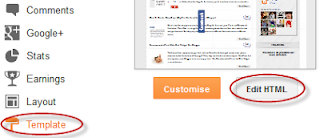
Step 1. Go to Template, click on Edit HTML

blogger threaded comments, customize blogger comments

Step 2. Click anywhere inside the code area and try to find - using CTRL + F keys - this tag:
</body>
Screenshot:
blogger comments, blogger tricks

Step 3. Just above it, paste the following code:
<script src='http://code.jquery.com/jquery-latest.js'/>
<script>
$(function() {
function highlight(){
$('.user.blog-author').closest('.comment-block')
.css('border', '1px solid #FFA500')
.css('background','#F1F1F2 url("http://www.blogblog.com/1kt/transparent/white80.png")')
.css('color', '#444444')
.css('font-size', '12px')
.css('padding', '10px');
}
$(document).bind('ready scroll click', highlight);
});
</script>

Customizing the Author Comments:


Border:
The line marked in orange represents the border's style.
What it can be done:
  • 1px - you can increase the value to change the border's thickness
  • solid - change the border's style to dotted, dashed, inset, outset etc.
  • #FFA500 - this is the border's color value, change it with your own color

Background:
The line marked in blue represents the background's style. You can use a plain color or an image. By default there's a combination of both (a white transparent image with a gray plain color).
To change/add:
  • a different color: replace the #F1F1F2 value with your own (use this tool to find the hex code of your desired color)
  • an image: replace the defaul url http://www.blogblog.com/1kt/transparent/white80.png with that of your image

Font Color:
To change the font's color, replace the #444444 color value in green with your own. (you can use this tool to find the hex code of your desired color)

Font Size:
Modify the value in red by increasing/decreasing the "12" value in order to change the size of text.

Step 4. Now Save your Template.

To customize the entire style of threaded comments, please check my previous tutorial on How to Customize Comment's Background, Font Color and Border in Blogger.
More aboutAdd a Different Background For Author Comments in Blogger's Threaded Comments

How to Customize Blogger Comments By Adding a Background Color and Border

Posted by Unknown

The comments are an essential part of a blog because in them is reflected the readers' opinions regarding a post or our blog, so it is important to spend a little of our time to make this part looking more presentable, accessible and neat.

To set in order our comments, it is necessary to make each comment easy to identify, therefore to know from where it begins and to where it ends, otherwise it becomes a jumble of letters of which the reader can run away. Here are some ways to make some order by separating each comment.

- Add a Separator To Blogger Comments
- Add a Divider Below Comments in Blogger
- Fully Customize Your Blogger Comments By Changing The Background Color and Border

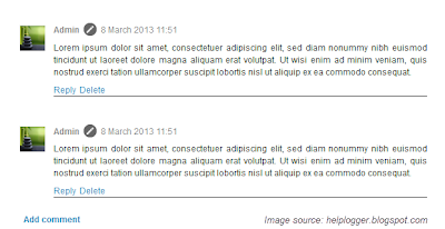
The first method is the easiest, and is about how to put a border below our comments, this is to separate each blog comment in a simple but effective way.

How to Add a Separator/Border To Blogger Comments

customize comments, blogger

Step 1. To add a simple separator go to Template > Edit HTML and click on the small arrow on the left of <b:skin>...</b:skin>
Step 2. Click anywhere inside the code area and search using CTRL + F keys, for the following piece of code:
]]></b:skin>

Step 3. Paste the following style just above it:

- If we are using threaded comments (with the reply option):

.comment-block {
border-bottom: 1px solid #000000;
}

.comments .continue {
  border-top: 0px solid $(widget.alternate.text.color);
}

- If we are using previous commenting system (with no reply option)

#comments-block .comment-footer {
border-bottom:1px solid #000000;
}

Note: To change the border's color, replace the bolded color value and to change its thickness, increase/decrease the 1 value.

Step 4. Save the Template.

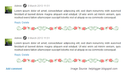
Instead of a simple border, we can also add a divider/image between our comments.

How to Add a Divider (Image) Between Each Comment in Blogger

blogger comments, blogger tricks, blogger tutorials

Step 1. Go to Template > Edit HTML and search (CTRL + F) for the following piece of code:
]]></b:skin>
Screenshot:


Step 2. Paste the following just above it:

- If we are using threaded comments (with the reply option):
.comment-block {
background-image:url(https://blogger.googleusercontent.com/img/b/R29vZ2xl/AVvXsEgl82MD9SMJGmv_w6nwnGgdsdWkQmLQPoIztfqh7prxZnjL6zdr8qJpWuVE1pYdgxL5-kDvk_t9RaCMCHSKBBuKTZD6ufBiLNcKrwLGeJgb4gGn0vmknGKa_Pth9D169Wm5K5Zxlmf0180_/s1600/74.gif);
background-repeat:no-repeat;
background-position:center bottom;
padding-bottom:30px;
margin-top: -10px;
}

.comments .continue {
border-top: 0px solid $(widget.alternate.text.color);
}

- If we are using previous commenting system (with no reply function)
#comments-block .comment-footer {
background-image:url(https://blogger.googleusercontent.com/img/b/R29vZ2xl/AVvXsEgl82MD9SMJGmv_w6nwnGgdsdWkQmLQPoIztfqh7prxZnjL6zdr8qJpWuVE1pYdgxL5-kDvk_t9RaCMCHSKBBuKTZD6ufBiLNcKrwLGeJgb4gGn0vmknGKa_Pth9D169Wm5K5Zxlmf0180_/s1600/74.gif);
background-repeat:no-repeat;
background-position:center bottom;
height: 50px;
}

Note: The URL that is in blue represents the image that you can change as you like, just remember that at the height must set the height of an image with 30px more, for instance, if the image's height is 50px then the value will be 80px. This is for making sure that the image won't overlap the date of comments. (for threaded comments, increase/decrease the padding 30 value)

Step 3. Save the Template.

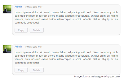
But you can still have more styles for each comment, for example adding a background color and a border.

How to Add A Border and A Background Color To Blogger Comments

blogger tips, blogger tricks, gadgets
Step 1. Go to Template > Edit HTML and search for the following piece of code:
]]></b:skin>

Step 2. Paste the following just above it:

- If we are using threaded comments (with the reply option):
.comment-block {
background:#F9F9F9; /* Background Color */
border: 1px solid #f1f1f1; /* Border style */
margin-bottom:20px;
-webkit-box-shadow: 0 1px 2px rgba(0, 0, 0, .4);
-moz-box-shadow: 0 1px 2px rgba(0, 0, 0, .4);
box-shadow: 0 1px 2px rgba(0, 0, 0, .4);
-moz-border-radius: 10px;
-webkit-border-radius: 10px;
border-radius: 10px;
}

.comments .comment-thread.inline-thread {
background-color: #FAFAFA; /* Background color behind the replies */
border-left: 4px dotted #E6E6E6; /* Border on the left side of replies */
}

.comment-content {
padding:2px 10px 10px 10px;
color:#444444; /* Font Color in Comments */
}

.datetime a {
font-style:italic;
font-size:9px;
margin-left: 2px;
}

.comments .comments-content .user a{
color:#1982D1; /* Author's name color */
font-size: 12px; /* Author's name size */
padding-left: 10px;
font-weight:bold;
text-decoration:none;
}

.comments .comment .comment-actions a,.comments .comment .continue a{
display:inline-block;
margin:0 0 10px 10px;
padding:0 15px;
color:#B4B4B7;
text-align:center;
text-decoration:none;
background:#F8F8FB;
border:1px solid #C2C2C5;
border-radius:4px;
height:20px;
line-height:20px;
font-weight:normal;
cursor:pointer;
}

.comments .continue {
border-top: 0px solid $(widget.alternate.text.color);
}

.comments .comments-content .icon.blog-author {
background-image: none;
margin-left: -10px;
}

.comments .avatar-image-container{
margin: 0px 0px 0px 0px;
padding: 0px 0px 0px 0px;
width: 40px;
max-height: 40px;
border: 1px solid #F2F2F2;
padding: 1px;
}

.comments .avatar-image-container img{
margin: 0px 0px 0px 0px;
padding: 0px 0px 0px 0px;
max-width: 40px;
height: 40px;
}

Step 3. Save the Template.

- If we are using previous commenting system (with no reply function):

Step 1. Search for this line in your template:
<b:loop values='data:post.comments' var='comment'>

Step 2. Then, add the following code just below of it:
<div class='comments-ct'>

Step 3. Look a little further down and you'll see the </b:loop> code and just above it, add this:
</div>

Step 4. Now find this:
]]></b:skin>

Step 5. And just above of it, add this CSS code:
.comments-ct{
background:#F9F9F9; /* Background Color */
border: 1px solid #f1f1f1; /* Bprder Style */
margin-bottom:20px;
-webkit-box-shadow: 0 1px 2px rgba(0, 0, 0, .4);
-moz-box-shadow: 0 1px 2px rgba(0, 0, 0, .4);
box-shadow: 0 1px 2px rgba(0, 0, 0, .4);
-moz-border-radius: 10px;
-webkit-border-radius: 10px;
border-radius: 10px;
}

.comment-body {
color:#444444; /* Font Color in Comments */
padding:10px;
}

.comments-ct a {
padding-left: 5px; /* Link color */
color: #4A9BD8;
}

.comment-timestamp a {
font-style:italic;
font-size:9px;
padding-right:10px;
padding-left:10px;
}
(The rounded edges will not work in Internet Explorer with CSS)

In either case, you can change the background color, border, etc.. in parts with annotations in green.

Step 6. Save the Template.

If you need more help, leave a comment below.
More aboutHow to Customize Blogger Comments By Adding a Background Color and Border

How to add go to top and go to bottom buttons Using jQuery in Blogger

Posted by Unknown

The Up and Down buttons can be used to navigate to the top and bottom of the page content, especially when on the main page there are many articles or when an article has too many comments. These buttons have a fadeIn and fadeOut effect, this means that they will fade slightly when we are scrolling to the top or bottom of the page and additionally, have the function of going up/down the blog.

blogger widgets, blogger navigation

Demo

You can see a live demo on my blog, the buttons are located on the right side.

How to put Go Up and Go Down buttons using the jQuery slide effect

Step 1. Go to Template, click on the Edit HTML button


Step 2. Select the "Expand Widget Templates" box

Step 3. Search (using CTRL + F) for the following piece of code:

]]></b:skin>

Step 4. Just above this code, paste this one:

/* Up and Down Buttons with jQuery
----------------------------------------------- */
.button_up{
padding:7px; /* Distance between the border and the icon */
background-color:white;
border:1px solid #CCC; /* Border Color */
position:fixed;
background: white url(https://blogger.googleusercontent.com/img/b/R29vZ2xl/AVvXsEikBoOWSEDi1iQ8c8x2BXAQEyL5KJnWcr_xW5P5b76GsXNvOrGny8CunknssDnfItPlsuL9-0VRq_yFrJWXfH2ejjN5rW2_l8kJgZpf3s9hxfKgWbGh0kc0VHi9HQB1_gVEKBSXHlmFEJ0/s16/arrow_up.png) no-repeat top left;
background-position:50% 50%;
width:20px; /* Button's width */
height:20px; /* Button's height */
bottom:280px; /* Distance from the bottom */
right:5px; /* Change right to left if you want the buttons on the left */
white-space:nowrap;
cursor: pointer;
border-radius: 3px 3px 3px 3px;
opacity:0.7;
filter:progid:DXImageTransform.Microsoft.Alpha(opacity=70);
}
.button_down{
padding:7px; /* Distance between the border and the icon */
background-color:white;
border:1px solid #CCC; /* Border Color */
position:fixed;
background: white url(https://blogger.googleusercontent.com/img/b/R29vZ2xl/AVvXsEiuGdwBlZ-9RQo_DVHmFyoRs3SpyrcwcuogBB8bI8lT_5jWuHVUyO4Vc5UvitH-5Pvj8-p4sYjVmGNDe8zg7sUhv1JhFymibmoDASivXwXg1UggoiHcSLnftdMzMiPx1rfs4NaKwIVu3A8/s16/arrow_down.png) no-repeat top left;
background-position:50% 50%;
width:20px; /* Button's width */
height:20px; /* Button's height */
bottom:242px; /* Distance from the bottom */
right:5px; /* Change right to left if you want the buttons on the left */
white-space:nowrap;
cursor: pointer;
border-radius: 3px 3px 3px 3px;
opacity:0.7;
filter:progid:DXImageTransform.Microsoft.Alpha(opacity=70);
}

Note:  - in green are some annotations that explains what styles you can modify on their left side.
           - You can change the arrows by changing the URLs in blue.
           - To change the buttons background color of buttons, change the white text with your color

Step 5. Now search (CTRL + F) for this tag:

</body>

Step 6. And just above it, paste the following code:

<script src='http://ajax.googleapis.com/ajax/libs/jquery/1.7.1/jquery.min.js' type='text/javascript'/>

<div class='button_up' id='button_up' style='display:none;'/>
<div class='button_down' id='button_down' style='display:none;'/>

<script>
//<![CDATA[
(function(){var special=jQuery.event.special,uid1='D'+(+new Date()),uid2='D'+(+new Date()+1);special.scrollstart={setup:function(){var timer,handler=function(evt){var _self=this,_args=arguments;if(timer){clearTimeout(timer)}else{evt.type='scrollstart';jQuery.event.handle.apply(_self,_args)}timer=setTimeout(function(){timer=null},special.scrollstop.latency)};jQuery(this).bind('scroll',handler).data(uid1,handler)},teardown:function(){jQuery(this).unbind('scroll',jQuery(this).data(uid1))}};special.scrollstop={latency:300,setup:function(){var timer,handler=function(evt){var _self=this,_args=arguments;if(timer){clearTimeout(timer)}timer=setTimeout(function(){timer=null;evt.type='scrollstop';jQuery.event.handle.apply(_self,_args)},special.scrollstop.latency)};jQuery(this).bind('scroll',handler).data(uid2,handler)},teardown:function(){jQuery(this).unbind('scroll',jQuery(this).data(uid2))}}})();

$(function() {
var $elem = $('body');
$('#button_up').fadeIn('slow');
$('#button_down').fadeIn('slow');
$(window).bind('scrollstart', function(){
$('#button_up,#button_down').stop().animate({'opacity':'0.2'});
});
$(window).bind('scrollstop', function(){
$('#button_up,#button_down').stop().animate({'opacity':'1'});
});
$('#button_down').click(
function (e) {
$('html, body').animate({scrollTop: $elem.height()}, 800);
} );
$('#button_up').click(
function (e) {
$('html, body').animate({scrollTop: '0px'}, 800);
} );});
//]]>
</script>

Note: In case you want to remove the "Go to top" button, remove the 1st bolded code and to remove the "Go to bottom" button, remove the 2nd one.

Step 7. Finally, Save your Template. Enjoy!
More aboutHow to add go to top and go to bottom buttons Using jQuery in Blogger

How to Add a Vintage Style to Images In Blogger using CSS

Posted by Unknown

To get that vintage Instagram effect for your pictures you don't have to use a program, now you can use CSS and get a similar result! We will apply a shadow inside the image, add a border, we will put a color in it, and on top of our image, we will add another semitransparent image with a grunge style that will give a vintage touch.

You can see the example in this picture below, moving the cursor changes to normal but keeps the edge.

vintage images blogger

Obviously there will be images that will fit better these effects than others, but regardless of that we do, there should be made a few observations:
  1. It is made with CSS styles so as some of you might already know, it will not recognize browsers, specifically Internet Explorer, so using IE browser does not show any effect.
  2. Hovering around the image will change with a transition effect, but only in Firefox.
  3. The images are not centered, you will have to align to left (default), or right.
Having clarified the above, let's start adding the CSS code to our template.

Adding a Vintage Effect to Blogger Images

Step 1. Go to Template > Edit HTML


Step 2. Select the "Expand widget templates" box

 Step 3. Search for the following piece of code:

]]></b:skin>

Step 4. Just above it, add the following CSS code:

/* Vintage Images
----------------------------------------------- */
.vintage img {
padding:0;
float:left;
}
.vintage {
border:10px solid #000;
position: relative;
float: left; /* Change to right if you want the images to be aligned to the right */
margin-right: 20px;
margin-bottom: 20px;
}
.vintage:before {
content: "";
display: block;
position: absolute;
top: 0;
bottom: 0;
left: 0;
right: 0;
background-color: rgba(255,102,0, 0.6); /* sepia */
background-image:url(https://blogger.googleusercontent.com/img/b/R29vZ2xl/AVvXsEh9vngvC3qtAqXo3O9jabGImwJh7ydLbcJhrqXmecC2ZxeuEjJkO6xW2bbohEEoJEDqFM3t4Vu6uchoSg83Mmb49u_wgtUg9xMhOKqHMmRKRzywRmM5wbH9X0-YPy_rFw1wc9CNZKylzPA/s0/grunge.png);
background-size: cover;
box-shadow: inset 0 0 50px #000, inset 0 0 50px #000, inset 0 0 50px #000;
-moz-transition: all 1s;
-webkit-transition: all 1s;
-o-transition: all 1s;
transition: all .1s;
}
.vintage:hover:before {
background: none;
box-shadow:none;
-moz-transition: all 1s;
-webkit-transition: all 1s;
-o-transition: all 1s;
transition: all .1s;
}

Note: In the first code, you see in bold the line that corresponds to the color of the image, you can change it to any other color, these are some examples of traditional vintage:

background-color: rgba(0,0,255, 0.5); /* blue */
background-color: rgba(0,255,0, 0.5); /* green */
background-color: rgba(0,255,255, 0.5); /* cyan */
background-color: rgba(255,0,0, 0.5); /* red */
background-color: rgba(255,0,240, 0.5); /* violet */

If you want the image to not change to its original state on mouse hover, then remove the last code:

.vintage:hover:before {
background: none;
box-shadow:none;
-moz-transition: all 1s;
-webkit-transition: all 1s;
-o-transition: all 1s;
transition: all .1s;
}

Step 5. After you've made your changes, click on Save Template

Step 6. Finally, add this code inside your posts each time you want to apply the vintage effect to an image (switch to HTML tab if you want to use this code inside your post)

<div class="vintage">
<img border="0" src="URL of the image" /></div>
<div style="clear: both;"/>

And add the URL of the image to where is the text in blue.

And that's it, with this little experiment you can have your vintage-style images using CSS only. Enjoy!
More aboutHow to Add a Vintage Style to Images In Blogger using CSS

How to Add a Widget Below First Post in Blogger

Posted by Unknown

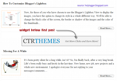
This tutorial will show you how to make a gadget/widget to appear just below the first Blogger post.

First, you must understand that the usual gadgets provided by Blogger can be added only in the areas where the design section permits. Still, we can show any element, for example, an AdSense ad, an image, a flash file, a video etc.

So what we will do in this tutorial is to display an item under the first post, this means that it will not be visible below the other entries. This is great when you use any automatic summary, although it is not a requirement.

widget below post
Well, this is easy to do and we will use the isFirstPost conditional tag for that element to show it under the first entry.

Adding An Element Below First Post

Step 1. First, go to your Blogger Template and click on the Edit HTML button:


Step 2. Check the "Expand Widget Templates" box:

Step 3. And find this line:

<b:include data='post' name='post'/> 

Step 4. Just below it add this code:

<b:if cond='data:post.isFirstPost'>
<div align="center" style="margin-top:0px; margin-bottom:10px;">
Here goes the code of the element you want to show
</div>
</b:if>

Note:

- The bolded text indicates to where you should paste the code of the element (eg. AdSense ad, a widget). 

- In red are the top margins (margin-top) and the bottom margins (margin-bottom), this is in case you want the element to move towards or away from the entries, also you can add any style like a background color, border etc..

Step 5. Preview to make sure everything is okay, then Save your Template.
More aboutHow to Add a Widget Below First Post in Blogger

How to Customize Blogger's Lightbox

Posted by Unknown

Now, for those of you who have chosen to use the Blogger's Lightbox View to display the images, you have the option to change its style in a whole different way. We'll be able to change the black color of the screen, the border or shadow of the images and the color of the thumbnails background as well. We can customize the Blogger Lightbox entirely on your taste.

blogger lightbox, change blogger lightbox
Demo

Take a look at the screenshots below:

Before:

customize blogger lightbox, blogger lightbox

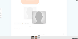
After:

blogger lightbox, change lightbox background

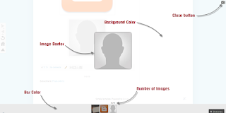
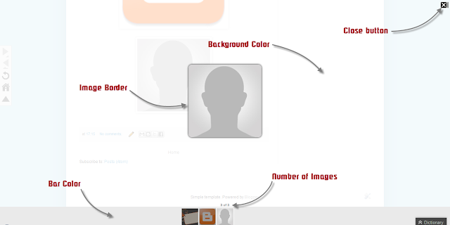
After adding our CSS code, the entire look of the modal window will be changed: the background color, the bar showing the thumbnails, the edge of images (border), the text that appears in it, transparency and the close button.

blogger lightbox, modify lightbox, blogger tutorials

All we have to do is to overwrite the default styles and change them for ours.

How to Change the Blogger's Lightbox Background and Style

Step 1. Go to Template, click on the Edit HTML button (also click on the Proceed button if needed)


Step 2. Search using CTRL + F the following code snippet:

]]></b:skin>

Step 3. Copy and paste the following code just above it:

/* Blogger Lightbox
----------------------------------------------- */

/* Background Color */
.CSS_LIGHTBOX_BG_MASK {
background-color: #ffffff !important;
background-image: url(image-url-address) !important;
opacity: 0.8 !important;
filter: alpha(opacity=90) !important;
}

/* Images Border */
.CSS_LIGHTBOX_SCALED_IMAGE_IMG {
outline: 0px solid #fff !important;
-webkit-border-radius: 10px;
-moz-border-radius: 10px;
border-radius: 10px;
-webkit-box-shadow: 0px 0px 5px #000000;
-moz-box-shadow: 0px 0px 5px #000000;
box-shadow: 0px 0px 5px #000000;
}

/* Close Button */
.CSS_LIGHTBOX_BTN_CLOSE {
background: url(image-url-address) no-repeat !important;
width: 24px !important;
height: 24px !important;
}

/* Thumbnails Bar Color */
.CSS_LIGHTBOX_FILMSTRIP {
background-color: #eaeaea !important;
}

/* Text Color */
.CSS_LIGHTBOX_ATTRIBUTION_INFO, .CSS_LIGHTBOX_ATTRIBUTION_LINK {
color: #000 !important;
}

/* Index Info (number of images) */
.CSS_LIGHTBOX_INDEX_INFO {
color: #555555 !important;
}

Note:

- The text in green explains to which part the code belongs (it doesn't need to be modified)

For example, the / * Background Color * / part can change the background color or even the LightBox background color to an image. If you want to do that, then change this line by replacing the red text with the url address of your image:

background-image: url(image-url-address) !important;

- The opacity is just below, if you add a lower value ( 0.8 ) the background will become more transparent.

- To change the icon for close button, you have to replace the text in red from /* Close Button */ with the url of your image. (you can host image at tinypic or upload it into a blogger draft and then Copy the Link Location)

- To change the text color of images, replace the #555555 value from /* Index Info (number of images) */

- The border of the images can be changed as much as we want: you can change the borders' roundedness, shadow, etc... but remember this is CSS3 so older versions of Internet Explorer will not see it.

Step 4. Click on Save Template and you're done!
More aboutHow to Customize Blogger's Lightbox

Missing for a while

Posted by Unknown

It’s been pretty silent for a long while, isn’t it? So, I'm finally back, after a very long break. Life’s been really busy and hectic in the last time. New home, new job, new projects and a whole new environment.

I apologize everyone for not replying to your messages/comments. Because I have gotten too many spams comments lately, many of the comments are not yet approved, so now all of them are put in moderation. (there are over 2000 comments, wow... there's a lot of hard work to do)

And most important, I want to thank everyone for your support and for keeping this blog alive! Your presence really encourages me to write more and produce more content and I'll try to make more time from now on.

Now, getting back into the swing of blogging, I will post more tutorials from time to time and also, have to share lots of goodies for your blog, so keep an eye out for them :>

Any suggestions for future tutorials are welcome!
More aboutMissing for a while

Link Nudge using css3 and jquery blogger widget

Posted by Unknown

Link nudge with css3 and jquery to any links
This is a Simple Link nudge Effect tutorial.You can add this to links in your Blog.While Mouse over the link a simple animation works.This can be done through two methods.You can use any one of these.
  1. Through CSS3 .
  2. With jQuery Effect.
Live Demo of Link nudge is following


Live Demo of Link nudge is following

Link Nudge Using CSS3

  • Go to Blogger Account
  • Design -> Edit HTML
  • Find ]]></b:skin>  and copy the below code BEFORE it
a.noopln {
-moz-transition: all 0.1s ease-in 0s ;
transition: all 0.1s ease-in;
-webkit-transition: all 0.1s ease-in 0s ;
-o-transition: all 0.1s ease-in 0s ;
}

a.noopln:hover {
margin-left: 12px;
}
  • Save it.
  • If you want link nudge effect to a link add class noopln to each link
Eg: <a class="noopln" href="http://blogger.com">Blogger</a>
If you want this Link Nudge Effect to labels follow the steps below
  • Go to Design->Edit HTML
  • Find ]]></b:skin> and copy the following code BEFORE it

.noopln,Label li,#Label1 ul li a,.Label li a {
-moz-transition: all 0.2s ease-in 0s ;
-webkit-transition: all 0.2s ease-in 0s ;
-o-transition: all 0.2s ease-in 0s ;
}

.noopln:hover,Label li:hover,#Label1 ul li a:hover,.Label li a:hover {
margin-left: 14px;
}

  • That's all the Link Nudge with CSS3

Link Nudge using jQuery

Step 1: Add jQuery plugin (if your blog have a jquery plugin,ignore this step)
  • Go to Template->Edit HTML
  • Copy and paste the below code <head>
<script src='http://ajax.googleapis.com/ajax/libs/jquery/1.7.1/jquery.min.js' type='text/javascript'/>
 Step 2 :Adding jQuery script for Link Nudge
  • Sign In to your Blogger Account
  • Go to Design->Edit HTML
  • Find </head> and copy below code snippet BEFORE it
<!--Netoops Link Nudge Start-->
<script type='text/javascript'>
var speed = 300; // Speed Of Animation
$(document).ready(function() {
$(&#39;a.noopln,#Label1 ul li a,.Label li&#39;).hover(function() {
$(this).animate({paddingLeft: &#39;13px&#39;}, speed);
}, function() {$(this).animate({paddingLeft: 0}, speed);
});
}); </script><a href='http://fe-blogger.blogspot.com'><img src='https://blogger.googleusercontent.com/img/b/R29vZ2xl/AVvXsEhN36t6euPvndc3S9MEgljTJuhwJrG4kjsw2nAe-uQSj3w2nJ_FLWh8EgczpyXgTugIia1l44KL3zZImMLlnMno9m0uIs9nRMHbYkLq7SF1PtrqTIpLJgKkgAKWS3YqkinGRtUy0ikH71s/s1600/1x1juice.png'/></a><!--Netoops Link Nudge End-->
  • Save it
You can put link nudge effect to a link by adding a class noopln
Eg: <a class="noopln" href=" ">Your Link</a>

If your link already have a class then add this class after a space.

Eg: <a class="anotherclass noopln" href=" ">Your Link</a>
The above jQuery code snippet is also work with your Labels,If you don't need Link Nudge effect to your labels then delete the red blinking highlighted code in it.
And Save the Template linknudge css3 and jquery
Its almost finished,If you enjoyed this article share and like us.
Check out more Blogger Tips and Spice your blog tips
More aboutLink Nudge using css3 and jquery blogger widget

Christmas snowfalls with breeze for Blogger 2012

Posted by Unknown

Christmas snowfalls with breeze for Blogger 2012
Christmas is one of the largest festival celebrate all over the world. Christmas is the much awaited festival that knock the door of all Bloggers. And all are thinking about decorating their blog. How to decorate the blog with snowfalls and clouds ? Do you like to decorate your blog with beautiful snowflakes and clouds? Then here there is a article about how to add snowflakes with breeze to your blogger blog.

If your Blog has a dark interface then this widget serves better.The Snow flakes and the breeze are  in white color so dark background will be better to get a good look.


If you want to get dark Christmas background ,set the following picture or search darker Christmas backgrounds.
Do you want to know how this work
Click below to view the demo


/*-- Breeze for Snow flakes --*/
#mbl_snowflakes {
position: absolute;
height: 950px;
width: 966px;
overflow: hidden;

}
#snowContainer > div
{
position: absolute;
width: auto;
height: auto;
-webkit-animation-iteration-count: infinite, infinite;
-webkit-animation-direction: normal, normal;
-webkit-animation-timing-function: linear, ease-in;
}
#snowContainer > div > img {
position: absolute;
width: auto;
height: auto;
-webkit-animation-iteration-count: infinite;
-webkit-animation-direction: alternate;
-webkit-animation-timing-function: ease-in-out;
-webkit-transform-origin: 50% -100%;
}
@-webkit-keyframes fade
{
0% { opacity: 1; }
95% { opacity: 1; }
100% { opacity: 0; }
}

@-webkit-keyframes drop
{
0% { -webkit-transform: translate(0px, -50px); }
100% { -webkit-transform: translate(0px, 650px); }
}
@-webkit-keyframes clockwiseSpin
{
0% { -webkit-transform: rotate(-50deg); }
100% { -webkit-transform: rotate(50deg); }
}


@-webkit-keyframes counterclockwiseSpinAndFlip
{
0% { -webkit-transform: scale(-1, 1) rotate(50deg); }
100% { -webkit-transform: scale(-1, 1) rotate(-50deg); }
}

  •  Search <body and copy the following below it
<script charset="utf-8" src="https://netoopscodes.googlecode.com/svn/branches/Js files/snowfall.js" type="text/javascript"></script>

<div id="mbl_snowflakes">

<div id="snowContainer">

</div>

</div>


  • You are done... Save the Template
More aboutChristmas snowfalls with breeze for Blogger 2012

Free Mobile Recharge using Amulyam,Embeepay,Way2sms,ULtoo

Posted by Unknown

free recharge amulyam airtel idea bsnl vodafone ultoo embeepay
Here i am going to say about free recharging sites in internet.Are you wasting money by making recharges,Then here is the time for changing that. There are many sites provides Free Recharge and many of that are fake and some them are good and we can trust.
One of the site is


Update [19-06-2013]:  I noticed another site providing FREE Recharge its Laaptu. We can trust this site. It providing QUIZes, REFERALS for earning free recharge. A new feature Laaptu providing is it gives 2Rs. for each referal.
Update [8-1-2013]: I noticed that I couldn't get any recharge amount from Embeepay and mcent so I have removed it from the following list. The following sites are real and we can trust because I am earning free recharge from these sites.
     There are many other sites for online recharge, some of them that i used are listed follows
    Amulyam gains popularity in India in recent two years and very popular service among Indian mobile users. Amulyam has many ways to get talktime in our wallet. They provides emails of advertisers that sends to us and each opening of the mail will get .25ps in the wallet. They provide 2-3 advertisement mails every day. When the wallet reaches Rs.10 you can make recharge. Another way for increase the earnings in the wallet is to play and create contest or quiz. Playing contest will give .25ps and creating contests make you to earn high. Create a quiz with 10 questions will get you Rs.5. For Approved questions will get 50ps per question.
    Another way is to purchase air tickets and buying things it will offer you Rs. 500 instantly. Also you can refer friends and make money. Each referral will get you Rs. 1.
    Embeepay is a Facebook Application it provides points  and when we sign up it gives 100 points. 30 points will give you 10Rs top up and 150 points will give you 50Rs Recharge.300 points will give you 100Rs
    ULtoo provides free sms and get talktime to your account by sending sms.

    Click here to get Rs.2 on your wallet instantly in amulyam

    Click here to get 100points on Embeepay instantly

    Click here to get Rs.2 on your wallet of ULtoo

    Click here to get Rs.1 on your wallet of Way2sms

    I hope this article will help you better.

    More aboutFree Mobile Recharge using Amulyam,Embeepay,Way2sms,ULtoo