Head banner image changing on reload for Blogger Blog

Posted by Unknown


Head banner image changing on reload for Blogger Blog


Today i am saying about an interesting thing .Head banner changing trick for blogger
This is a simple blogger hack.when you add this, your blogger blog's header image will change after RELOAD the webpage on your browser.
 Follow the instructions :)

  • Sign In to your blogger account.
  • Go to Template->Edit HTML
  • Find ]]></b:skin> and paste the following code before it.
#header {
background: url("your header image url in quotes") no-repeat left bottom;
margin:0;
padding:2px;
}
  • Then copy the below script  and place above the </head> tag:

<script type="text/javascript">
var banner= new Array();

banner[0]="1st image url";
banner[1]="2nd image url";
banner[2]="3rd image url";
banner[3]="4th image url";
banner[4]="5th image url";
var random=Math.round(4*Math.random());

document.write("<style>");
document.write("#header {");
document.write(' background:url("' + banner[random] + '") no-repeat left TOP;');
document.write(" }");
document.write("</style>");
</script>
you are done...:)
If any problem with this blogger trick please leave comment,don't hesitate to ask,we are happy to help you:)
More aboutHead banner image changing on reload for Blogger Blog

Remove Threaded Comments in blogger Easily trick revealed

Posted by Unknown

remove threaded comments blogger
This is a simple article explaining How to remove Blogger 's New Threaded commenting system easily.There are some problems with it,Many users report that when a user click on post link,it takes control to the bottom of the page(to the comment section).Would you think that Threaded commenting system is not Good for Blog? Then you can remove it.
I am not going to say too much about Threaded commenting System,because i hope you know about it.
Follow the instructions below carefully.


Before Editing Template,you must Backup your template(How to Backup Template?)

  • Go to Design-> Edit HTML
  • Tick on Check box  Expanded Widget Templates
  • Find the code data:post.showThreadedComments easily using ctrl+F
  • You will found code snippet like this
<b:if cond='data:post.showThreadedComments'>
            <b:include data='post' name='threaded_comments'/>
          <b:else/>
            <b:include data='post' name='comments'/>
          </b:if>
        </b:if>
        <b:if cond='data:blog.pageType == &quot;item&quot;'>
          <b:if cond='data:post.showThreadedComments'>
            <b:include data='post' name='threaded_comments'/>
          <b:else/>
            <b:include data='post' name='comments'/>
          </b:if>
        </b:if>
  • Replace it carefully with the following code [Note: You will find the above code twice,replace it twice]
<b:include data='post' name='comments'/>
          </b:if>
               <b:if cond='data:blog.pageType == &quot;item&quot;'>
                     <b:include data='post' name='comments'/>
      
        </b:if>
  • Save it ,
No longer Threaded commenting appear on your blog.Normal commenting will back.
Cheers..!

More aboutRemove Threaded Comments in blogger Easily trick revealed

Awesome Random Posts Widget for blogger Blog

Posted by Unknown

random posts widget
Random Posts widget is an awesome widget for your Blogger Blog.Most important feature of this widget is it lets your Blog visitors to surf more blog posts in your blog.Surely it increases your Blog's internal links that lets your blog higher traffic.
Its let your users to spend more time in your Blog.


Install Random posts widget

Make sure you are Sign In to your Blogger Account.

If you are a beginner in Blogger Editing ,use our one click Widget
  • Click the below Add to Blogger Button to install

Manually Add Random posts Widget

  • Sign In to your Blogger Account.
  • Go to Design->Page Elements
  • Click on Add Gadget and look for HTML/Javascript take it
  • Give the title as you need(eg:Random Posts)
  • Copy and paste the below code to the content section
<style type="text/css">
.noop-random-posts ul li {
    list-style-image: url("https://blogger.googleusercontent.com/img/b/R29vZ2xl/AVvXsEgaO8Vp91KmGdU5ySxdA2gEr_alZVZjZbCVWEMt6JMyzPOHtMU4iT6lwJfO7o1AiYFV88JqG6EMUDDkg1SZUxugM5yADdmmYTpWTR1xrD43ENvbti28raO_2Wvn0KnrQZ-LQKcB5i-7Oxs/s1600/tick+list+style.png");
}
</style>
<div class="noop-random-posts"><script type="text/javascript">
    var randarray = new Array();var l=0;var flag;
    var numofpost=5;function nooprandomposts(json){
    var total = parseInt(json.feed.openSearch$totalResults.$t,10);
    for(i=0;i < numofpost;){flag=0;randarray.length=numofpost;l=Math.floor(Math.random()*total);for(j in randarray){if(l==randarray[j]){ flag=1;}}
    if(flag==0&&l!=0){randarray[i++]=l;}}document.write('<ul>');
    for(n in randarray){ var p=randarray[n];var entry=json.feed.entry[p-1];
    for(k=0; k < entry.link.length; k++){if(entry.link[k].rel=='alternate'){var item = "<li>" + "<a href=" + entry.link[k].href + ">" + entry.title.$t + "</a> </li>";
    document.write(item);}}
    }document.write('</ul>');}
    </script><a href="http://fe-blogger.blogspot.com" style="font-size:0pt">Blogger Widgets</a>
<script type="text/javascript" src="/feeds/posts/default?alt=json-in-script&start-index=1&max-results=1000&callback=nooprandomposts"></script></div>

Click on Save and its Done...If you have any doubts don't hesitate to ask.Please Comment.
I hope you had enjoyed this post.Leave Comments...
More aboutAwesome Random Posts Widget for blogger Blog

Awesome Stylish 404 Error Pages For Blogger

Posted by Unknown

Custom 404 Error Page for Blogger
404 Error or Page Not Found Error generated by Blogger when a user enters an invalid URL or 404 Error is an HTTP status code that means the page you are trying to reach on your Blog couldn't found or Page not exist in the Server.
By Default Blogger shows Error page message in a box and its not look Style.
Here I am saying about how to Customize it much better...


Only Custom message [No Style]

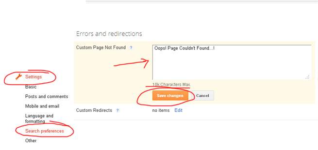
If you want to show only a custom message then First Go to updated Blogger Interface
Then Go to Setting->Search Preferences

Error Message with Stylish 404 images

If you want Colorful Stylish  404 page do the following.
  • Go to Design->Edit HTML
  • Find </head> and copy the below code just above it.
<b:if cond='data:blog.pageType == "error_page"'>
<style type="text/css">.status-msg-wrap{font-size:100%;margin:none;position:static;width:100%}.status-msg-border{display:none}.status-msg-body{padding:none;position:static;text-align:inherit;width:100%;z-index:auto}.status-msg-wrap a{padding:none;text-decoration:inherit}</style>
</b:if>
  • Save the Template

Error Page Style 1

Custom 404 error page for blogger 1

  •  Go to Setting->Search Preferences
  • Copy below code in Custom Page Not Found section [as shown in fig. first]
<h2 style="font-size: 35px;margin: 0;text-align: center;">Oops..! </h2>
<h3 style="font-size:17px;">Sorry,You are trying to reach an invalid page...!<br><a href="/">Click here</a> to go to Homepage <br> Have a nice Day...</h3><img src="https://blogger.googleusercontent.com/img/b/R29vZ2xl/AVvXsEjCQWIbzK0D4lEb9g0j5tgNNVdpCD6n264clrfRGscH5AMMzEJwf5coJsQY6JNnHkMbyW2z4QL0qAtmG1Zl2frP0Bn6qcjZIFxLjGRyyZfArkbOksXrq8LWlzuLbDjT6ZyeQdDAqbaGalE/s1600/404+error+page+1.jpg"/>

Error Page Style 2

Blogger custom Error page
  • Go to Setting->Search Preferences
  • Copy below code in Custom Page Not Found section [as shown in fig. first]
<h2 style="font-size: 35px;margin: 0;text-align: center;">Oops..! </h2>
<h3 style="font-size:17px;">Sorry,You are trying to reach an invalid page...!<br><a href="/">Click here</a> to go to Homepage <br> Have a nice Day...</h3><img src="https://blogger.googleusercontent.com/img/b/R29vZ2xl/AVvXsEipv2XvCGiD_8QgLzl8Eg3LunWnQo8A1C_9qOt52eRiRQzQF2EHB1laVSbryoKBlcn48gDHrFQEfqN0WVrvPRpPqBzFbJS-WrJA5B4IISA2o0f4JBGb6al2CdOKL-cv8gJkM20DfhlEsJw/s1600/404+error+page+2.jpg"/>

Error Page Style 3


  • Go to Setting->Search Preferences
  • Copy below code in Custom Page Not Found section [as shown in fig. first]
<h2 style="font-size: 35px;margin: 0;text-align: center;">Oops..! </h2>
<h3 style="font-size:17px;">Sorry,You are trying to reach an invalid page...!<br><a href="/">Click here</a> to go to Homepage <br> Have a nice Day...</h3><img src="https://blogger.googleusercontent.com/img/b/R29vZ2xl/AVvXsEhZi1TFP1lz4VQQf0Iy-OI8jFvuL642VgHOHcsZNSR0B0RYPA5iggU8SONg6siZ8EnhXJR63Ge7e1lPY_lbkfU6Ovm6slnZizlMX-8j5G0gw5jHB8PvIEPXSlid2sstfgNzH0iCokZhKrE/s1600/404+error+page+4.jpg"/>

Error Page Style 4

blogger custom 404 error page
  • Go to Setting->Search Preferences
  • Copy below code in Custom Page Not Found section [as shown in fig. first]
<h2 style="font-size: 35px;margin: 0;text-align: center;">Oops..! </h2>
<h3 style="font-size:17px;">Sorry,You are trying to reach an invalid page...!<br><a href="/">Click here</a> to go to Homepage <br> Have a nice Day...</h3><img src="https://blogger.googleusercontent.com/img/b/R29vZ2xl/AVvXsEiLVh-JPQoNbB-Xn98bQDeQy6R051p1zMYda_Nb5vX3hm-kkuFeA0Shq6MlAnN166-UZJr4cGc_veNQtxhZxGL80LtNen3rVneagAMxY99aZ80q7atooySscoRGRJL8p9w4A5RY3hDi05U/s320/404+error+page+6.jpg"/>

Error Page Style 5


  • Go to Setting->Search Preferences
  • Copy below code in Custom Page Not Found section [as shown in fig. first]
<h2 style="font-size: 35px;margin: 0;text-align: center;">Oops..! </h2>
<h3 style="font-size:17px;">Sorry,You are trying to reach an invalid page...!<br><a href="/">Click here</a> to go to Homepage <br> Have a nice Day...</h3><img src="https://blogger.googleusercontent.com/img/b/R29vZ2xl/AVvXsEiMZA8HFes24PdIwRXjrufF18d54QPyZsJr7BxAHos5v8_VsjLpSmerA3BnW3mWBi8knDU_s37-JTn2rG0Fs9jYP1_zAsy16GggxH6Aw5k2en-87QEDE40Y7PfjwHyiKyWRbpF4Byg80m0/s1600/404+error+page+7.jpg"/>

Error Page Style 6


  • Go to Setting->Search Preferences
  • Copy below code in Custom Page Not Found section [as shown in fig. first]
<h2 style="font-size: 35px;margin: 0;text-align: center;">Oops..! </h2>
<h3 style="font-size:17px;">Sorry,You are trying to reach an invalid page...!<br><a href="/">Click here</a> to go to Homepage <br> Have a nice Day...</h3><img src="https://blogger.googleusercontent.com/img/b/R29vZ2xl/AVvXsEjOIQKQeKwIkCRvSiJwz7kab6VoODHQjaa_J-V93H01qBr0z4MuNp_IsEylWr-VmMhcqQnpF6IV5I5IQGEbG4c2XVIAQEfqcl5eJK6qFDHRKRuOfK8w5vT8fFCm6h2OY-R4IGF6lx7rgvU/s1600/404+error+page+3.jpg"/>

Then Click Save..That all..
First thanks to Bloggerplugins.com for the custom error page code, visit here. Then i made some changes and add beautiful 404 images that i was inspired from HongKiat .

I thinks this article helped you..If any bugs of doubts don't hesitate to ask..do comment...
Like and share...
More aboutAwesome Stylish 404 Error Pages For Blogger

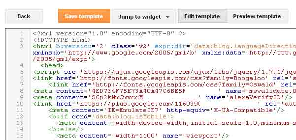
Expand Widget Templates in new Blogger HTML Template Editor

Posted by Unknown

Today I am sharing a useful post that all of Blogger Bloggers searching in Blogger New HTML Editor.
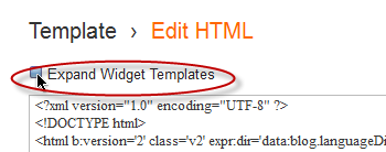
In old HTML Editor, there is an option "Expand Widget Templates".
By default while editing HTML code, Blogger shows only core of template and not shows the Blogger Widget codes. To see the full template code you have to select the option "Expand Widget Templates"
This option is very useful to add new features or additional features inside specific widgets in Blogger template.
Here I am going to show you how to do in new Blogger HTML Editor.


This is the option in old Blogger Template.
The new Blogger Template looks like the following.


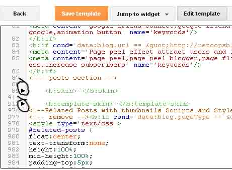
You can't expand all widgets simultaneously. You have to expand each Widgets by clicking the right arrows as shown below.


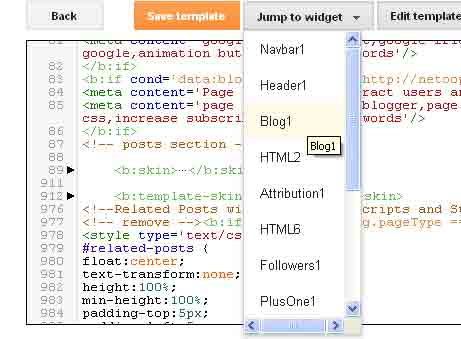
Also you can expand the code of specific widget, take "Jump to widget" from the drop down box take the appropriate widget to see the code.
I think this article will help you not a lot but a little, if so please take a few seconds to share this article..
More aboutExpand Widget Templates in new Blogger HTML Template Editor

Horizontal menu with sub-tabs in two columns for Blogger

Posted by Unknown

This is a very nice horizontal menu in which its sub-tabs are displayed in two columns and is also made with CSS, without any scripts.
blogger navigation menu, css menu, drop-down menu
The "advantage" so to speak, is that the sub-tabs when arranged in two columns are not very long, so it will be neat and less space along. You can see an example here:


Adding A Horizontal Menu With Sub Tabs in Two Columns To Blogger

STEP 1: In Blogger, go to your "Layout" and on the "Page Elements" section.
  • Click on the "Add a Gadget" link just under your header image
  • From the Gadget's List, select "HTML/JavaScript" option.
STEP 2: Simply copy and paste this ENTIRE code into your widget. Note: Leave the "Title" section of this widget blank.
<div id='menucol'>
<div id='topwrapper'>
<ul id='top'>
<li><a href='http://YOUR URL HERE.com'>Tab 1 Title Here</a></li>
<li><a href='http://YOUR URL HERE.com'>Tab 2 Title Here</a></li>
<li><a class='submenucol' href='#'>Tab 3 Title Here</a>
<ul>
<li><a href='http://YOUR URL HERE.com'>Sub Tab 3.1</a></li>
<li><a href='http://YOUR URL HERE.com'>Sub Tab 3.2</a></li>
<li><a href='http://YOUR URL HERE.com'>Sub Tab 3.3</a></li>
<li><a href='http://YOUR URL HERE.com'>Sub Tab 3.4</a></li>
<li><a href='http://YOUR URL HERE.com'>Sub Tab 3.5</a></li>
<li><a href='http://YOUR URL HERE.com'>Sub Tab 3.6</a></li>
</ul>
</li>
<li><a class='submenucol' href='#'>Tab 4 Title Here</a>
<ul>
<li><a href='http://YOUR URL HERE.com'>Sub Tab 4.1</a></li>
<li><a href='http://YOUR URL HERE.com'>Sub Tab 4.2</a></li>
<li><a href='http://YOUR URL HERE.com'>Sub Tab 4.3</a></li>
<li><a href='http://YOUR URL HERE.com'>Sub Tab 4.4</a></li>
<li><a href='http://YOUR URL HERE.com'>Sub Tab 4.5</a></li>
<li><a href='http://YOUR URL HERE.com'>Sub Tab 4.6</a></li>
</ul>
</li>
<li><a class='submenucol' href='#'>Tab 5 Title Here</a>
<ul>
<li><a href='http://YOUR URL HERE.com'>Sub Tab 5.1</a></li>
<li><a href='http://YOUR URL HERE.com'>Sub Tab 5.2</a></li>
<li><a href='http://YOUR URL HERE.com'>Sub Tab 5.3</a></li>
<li><a href='http://YOUR URL HERE.com'>Sub Tab 5.4</a></li>
<li><a href='http://YOUR URL HERE.com'>Sub Tab 5.5</a></li>
<li><a href='http://YOUR URL HERE.com'>Sub Tab 5.6</a></li>
<li><a href='http://YOUR URL HERE.com'>Sub Tab 5.7</a></li>
<li><a href='http://YOUR URL HERE.com'>Sub Tab 5.8</a></li>
</ul>
</li>
<li><a href='http://YOUR URL HERE.com'>Tab 6 Title Here</a></li>

</ul>
<br class='clearit'/>
</div>
</div>
Customize your main tabs by changing the Tab Titles to whatever you want. Include a URL for each one if you want it to be 'clickable'. If not, you can just put a # sign where it says http://YOUR URL HERE.com

You can add or delete as many of the main tabs as you need, just make sure to copy the entire code for the main tab for each additional tab you want:
<li><a href='http://YOUR URL HERE.com'>Tab 7 Title Here</a>
<ul>
<li><a href='http://YOUR URL HERE.com'>Sub Tab 7.1</a></li>
<li><a href='http://YOUR URL HERE.com'>Sub Tab 7.2</a></li>
<li><a href='http://YOUR URL HERE.com'>Sub Tab 7.3</a></li>
</ul>
</li>
STEP 3: Now let's go a step further and add the CSS style in our Template
  • Go to Template > Edit HTML
  • Click on the sideways arrow next to <b:skin>...</b:skin> 

  • Then click anywhere inside the code area and search - using CTRL + F keys - for the ]]></b:skin> tag and just above ]]></b:skin> add this code:
/* Horizontal menu with 2 columns
----------------------------------------------- */
#menucol {
width:940px;
height:37px;
background-image: -moz-linear-gradient(top, #666666, #000000);
background-image: -webkit-gradient(linear, left top, left bottom, color-stop(0.00, #666666), color-stop(1.0, #000000));
filter: progid:DXImageTransform.Microsoft.Gradient(gradientType=0,startColorStr=#666666,endColorStr=#000000);
border-bottom:1px solid #666666;
border-top:1px solid #666666;
margin:0 auto;padding:0 auto;
overflow:hidden;
}
#topwrapper {
width:940px;
height:40px;
margin:0 auto;
padding:0 auto;
}
.clearit {
clear: both;
height: 0;
line-height: 0.0;
font-size: 0;
}
#top {
width:100%;
}
#top, #top ul {
padding: 0;
margin: 0;
list-style: none;
}
#top a {
border-right:1px solid #333333;
text-align:left;
display: block;
text-decoration: none;
padding:10px 12px 11px;
font:bold 14px Arial;
text-transform:none;
color:#eee;
}
#top a:hover {
background:#000000;
color:#F6F6F6;
}
#top a.submenucol {
background-image: url(https://blogger.googleusercontent.com/img/b/R29vZ2xl/AVvXsEioJt8FAkQBrSZIO1pvHHcSGBkIrYWDed9anSZB-YdbbKmA27Wi6TAUI2SKn7FusTm0sgObz_bGg2AqfM6FGPlUBYHrfH6GfOULkjFsTQburzy6cNvLW-K1PvPeZ2onJGUBChkYSd4H99Y/s1600/arrow_white.gif);
background-repeat: no-repeat;
padding: 10px 24px 11px 12px;
background-position: right center;
}
#top li {
float: left;
position: relative;
}
#top li {
position: static !important;
width: auto;
}
#top li ul, #top ul li {
width:300px;
}
#top ul li a {
text-align:left;
padding: 6px 15px;
font-size:13px;
font-weight:normal;
text-transform:none;
font-family:Arial, sans-serif;
border:none;
}
#top li ul {
z-index:100;
position: absolute;
display: none;
background-color:#F1F1F1;
margin-left:-80px;
padding:10px 0;
border-radius: 0px 0px 6px 6px;
box-shadow:0 2px 2px rgba(0,0,0,0.6);
filter:alpha(opacity=87);
opacity:.87;
}
#top li ul li {
width:150px;
float:left;
margin:0;
padding:0;
}
#top li:hover ul, #top li.hvr ul {
display: block;
}
#top li:hover ul a, #top li.hvr ul a {
color:#333;
background-color:transparent;
text-decoration:none;
}
#top ul a:hover {
text-decoration:underline!important;
color:#444444 !important;
}
  • Now find (CTRL + F) this line:
/* Tabs
  • It will also have some little lines beneath:
/* Tabs
----------------------------------------------- */
  • And just below these little lines, delete the code below until you reach at:
/* Columns
----------------------------------------------- */
  • Instead of the code that you have removed, add this one:
#crosscol ul {z-index: 200; padding:0 !important;}
#crosscol li:hover {position:relative;}
#crosscol ul li {padding:0 !important;}
.tabs-outer {z-index:1;}
.tabs-inner {padding: 0 0px;}
See this screenshot for more info:
menu for blogger, blogger gadgets, blogger widgets
STEP 4: The final step is to Save the Template and you are done!

Visit your blog to see a beautiful navigation menu just below header.
If you have any questions or need help, leave a comment below.
More aboutHorizontal menu with sub-tabs in two columns for Blogger

Fade In/Out Page Loading Effect On Blogger Posts

Posted by Unknown

A very common effect in jQuery is the fade effect that hides or shows an element by fading it, and we can use it in many ways as for example in the blog's navigation. The following script does just that, by loading the page with a fading effect when we browse on internal links that are in the blog, such as post titles, labels links, archive, navigation links, etc..
jQuery effect, fade in effect, blogger jQuery
You can see an example in this demo blog, click on the title of any post and see the fading effect when the page is loading.

How To Implement the Fade In Loading Effect

1) To put this fading effect on your blog, go to your Template > Edit HTML :

fading effect, blogger blogspot, blogger tricks

2) Click anywhere inside the code area and search for the </head> tag using CTRL + F keys:


3) Then, just above </head> add the following code:
<script src='http://ajax.googleapis.com/ajax/libs/jquery/1.8.2/jquery.min.js' type='text/javascript'/>
<script type='text/javascript'>
//<![CDATA[
$(document).ready(function() {
$("body").css("z-index", "-10");
$("body").fadeIn(0);

$("a").click(function(event){
event.preventDefault();
linkLocation = this.href;
$("body").fadeOut(500, redirectPage); });
function redirectPage() {
window.location = linkLocation;
}
});
//]]>
</script>
<style>
html {
background-color: #F2F2F2; /* Color fading */
}
</style>
4) Save the changes and that's it. In green you can see where to change the color that fades on a loading page.

The original script hides the body of the page while loading, I prefer to change that property with a negative z-index to avoid problems with the search engine robots that may effect the positioning.

Problems?

Consider that such effects could increase the blog loading time, so I recommend using it only when your blog loads fast and does not have too many scripts.

If you already use another version of jQuery remove the other, leaving only this which will be readed first.

If you are using Mootools or Scriptaculous, then you have to make some modifications to the code in order to be compatible.

If you have another script with a fade effect, then it could interfere with this and you might not see anything on the page except the color fading, in such cases it is better without this script.

You can also use this effect only on some links, for example, if you want to appear only when you click on the post titles in the navigation links (older posts and newer posts), and on the top tabs, then replace this line:
$("a").click(function(event){
With this:
$(".post-title a, .blog-pager-older-link, .blog-pager-newer-link, .tabs").click(function(event){
In some cases, the page can load for a second and then load with the fade effect, this may be "normal" because the browser is slow to read the script on page load.

Apart from these drawbacks, I think it's a very elegant way to load blog pages while browsing them, don't you think?
More aboutFade In/Out Page Loading Effect On Blogger Posts

Using the :before and :after Pseudo Elements on Sidebar Titles

Posted by Unknown

This is another method of using the :after and :before properties and it will work without too many problems in any browser, including IE8. What this trick will do is to divide the header bar into left and right sections, where the left will contain an explanatory title and the right, a related link.

The idea of generating Adobe-like Arrow Headers was actually discussed by css-tricks and adapted to Blogger.

How to Add Adobe-like Headers to Blogger

blogger gadgets, blogger tricks, blogger blogspot

Step 1. Log in to your Blogger dashboard > go to Template > Edit HTML, then click anywhere inside the code area to search - using the CTRL + F keys - for the following tag:
</head>
Step 2. Just above it, copy and paste this code:
 <style>
.module h2 {
  background-color: #D5D5D5;
  border-radius: 20px 0 0 20px;
  color: #FFFFFF;
  font-family: Verdana;
  font-size: 14px;
  line-height: 32px;
  margin: 0;
  padding: 0 0 0 20px;
  text-shadow: 2px 1px 1px #222;
}

.module h2 a {
    border-left: 5px solid #ffffff;
    color: #101921;
    float: right;
    font-size: 14px;
    text-decoration: none;
    text-shadow: none;
    padding: 0 10px;
    position: relative;
   -moz-transition: padding 0.1s linear;
   -webkit-transition: padding 0.1s linear;
   -ms-transition: padding 0.1s linear;
   -o-transition: padding 0.1s linear;
}
.module h2 a:hover {
  padding: 0 32px;
}

.module h2 a:before, .module h2 a:after {
    content: &quot;&quot;;
    height: 0;
    position: absolute;
    top: 50%;
    width: 0;
}
.module h2 a:before {
    border-bottom: 8px solid transparent;
    border-right: 8px solid #ffffff;
    border-top: 8px solid transparent;
    left: -12px;
    margin-top: -8px;
}
.module h2 a:after {
    border-bottom: 6px solid transparent;
    border-top: 6px solid transparent;
    left: -6px;
    margin-top: -6px;
}

.module.blue h2 a {background-color: #A2D5EC;}
.module.blue h2 a:hover {background-color: #C5F0FF;}
.module.blue h2 a:after {border-right: 6px solid #A2D5EC;}
.module.blue h2 a:hover:after {border-right-color: #C5F0FF;}

.module.yellow h2 a {background-color: #FCE98D;}
.module.yellow h2 a:hover {background-color: #FFD700;}
.module.yellow h2 a:after {border-right: 6px solid #FCE98D;}
.module.yellow h2 a:hover:after {border-right-color: #FFD700;}

.module.green h2 a {background-color: #bada55;}
.module.green h2 a:hover {background: #C7E176;}
.module.green h2 a:after {border-right: 6px solid #bada55;}
.module.green h2 a:hover:after {border-right-color: #C7E176;}

.module.red h2 a {background-color: #F0A5B5;}
.module.red h2 a:hover {background-color: #FFC7D2;}
.module.red h2 a:after {border-right: 6px solid #F0A5B5;}
.module.red h2 a:hover:after {border-right-color: #FFC7D2;}
</style>
Step 3. Save the Template.

Screenshot:


Step 4. Now go to Layout and Add a new HTML/JavaScript Gadget with one of the codes below for each of the widget title:

Background in blue:
<div class="module blue">
<h2>Title in <a href="Link URL">Blue</a></h2>
</div>
Background in yellow:
<div class="module yellow">
<h2>Title in <a href="Link URL">Yellow</a></h2>
</div>
Background in green:
<div class="module green">
<h2>Title in <a href="Link URL">Green</a></h2>
</div>
Background in red:
<div class="module red">
<h2>Title in <a href="Link URL">Red</a></h2>
</div>

Note: Change "Title in" text with your widget's title and Blue, Yellow, Green and Red with the text on the right, then add a Link URL to it.

Step 5. After you saved the HTML/Javascript gadgets containing the codes above, drag and drop them just above the widgets you want to show... and Save the Arrangement.
blogger tricks, blogger tutorials

DEMO

You can see how the sidebar titles has been replaced with some cool header bars on this demo blog.
More aboutUsing the :before and :after Pseudo Elements on Sidebar Titles

Multi Hover Effect On Blogger Images Using Pure CSS

Posted by Unknown

Today I'm going to show you how to add an amazing mouseover effect for Blogger images using only CSS, in which moving your mouse over an image from different directions (from above, from below, etc) will cause an overlay transitioned in from the same vector. This trick will change not only the images appearance when moving mouse over them, but will also allow you to add inside a text with a description.

hover effect, mouseover, blogger hover effects

You can see the effect on this image below: try moving your mouse from the left, right, and above.

hover right hover top hover left hover bottom

Adding Hover Effect From Different Directions on Blogger Images

First thing to do is to add the CSS style to our Template:

Step 1. From Blogger Dashboard, go to Template and press the Edit HTML button


Step 2. Search for the </head> tag - to find it, click anywhere inside the code area, press CTRL + F keys and type it in the search box.


Step 3. After you found it, add the following style just above it: 
<style>
  /* The container and the image */
  div.multi-hover {
    overflow: hidden;
    position: relative;
    vertical-align: middle;
    width: 100%;
    height: 358px;
    line-height: 358px;
  }
  div.multi-hover img {width: 100%;}

/* The texts that, by default, are hidden */
  div.multi-hover span {
    color: #FFF;
    font-size: 32px;
    font-weight: bold;
    height: 100%;
    opacity: 0;
    position: absolute;
    text-align: center;
    transition: all 0.3s linear 0s;
    width: 100%;
  }

/* And this is what will generate the effect */
  div.multi-hover span:nth-child(1) { /* right */
    background: none repeat scroll 0 0 rgba(255, 189, 36, 0.6);
    left: 90%;
    top: 0;
  }
  div.multi-hover span:nth-child(2) { /* top */
    background: none repeat scroll 0 0 rgba(106, 170, 255, 0.6);
    left: 0;
    top: -80%;
  }
  div.multi-hover span:nth-child(3) { /* left */
    background: none repeat scroll 0 0 rgba(204, 87, 166, 0.6);
    left: -90%;
    top: 0;
  }
  div.multi-hover span:nth-child(4) { /* bottom */
    background: none repeat scroll 0 0  rgba(97, 181, 115, 0.6);
    left: 0;
    top: 80%;
  }

  div.multi-hover span:hover {opacity: 1;}
  div.multi-hover span:nth-child(2n+1):hover {left: 0;}
  div.multi-hover span:nth-child(2n):hover {top: 0;}

</style>
Step 4. Save the Template

Now we are going to add the HTML that is nothing but a DIV where we included four SPAN tags with texts and an image:

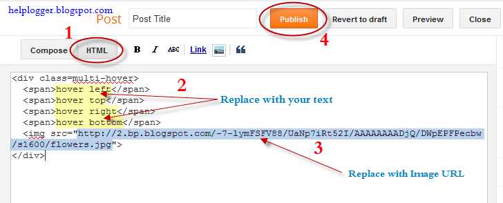
Step 5. Choose Posts, create a New Post, click on the HTML tab (1) and paste this code inside the empty box:
<div class=multi-hover>
  <span>hover right</span>
  <span>hover top</span>
  <span>hover left</span>
  <span>hover bottom</span>
  <img src="https://blogger.googleusercontent.com/img/b/R29vZ2xl/AVvXsEigRXcW3_RBTHIjBPh0-FBD-ESmTldJLFCd0RaOQwI0oHt97ynkU7jz6wrcPF1gCYZMlX3TK-YElUmN7NlH8LE8W9hgiOHMgpyza3V7q3wSvWdbb2EG6LGs86Wxyeh_geK5ncx3AK73SH4/s1600/flowers">
</div>
Add your own text/description to "hover right", "hover top", "hover left" and "hover bottom" (2) and replace the url in blue with the image URL (3) where you want to apply the effect.

Important! Do not click on the Compose tab, otherwise the changes will be lost.


Step 6. After you finished editing your post, click Publish (4)

And that's it... enjoy! :)
More aboutMulti Hover Effect On Blogger Images Using Pure CSS

How To Add Social Media Icons to Blogger Header

Posted by Unknown

social media icons, facebook icons, social media icons for bloggerThis tutorial will help you to add social media icons in the top right corner of the page which could increases the likelihood that readers can follow through the various social networks. There are several ways to do this, like adding a new widget section to the blog header but now, we'll do it using an unordered list that uses icons of Facebook, Twitter, Google+ and blog feed, and as a bonus, the icons will rotate when you hover over them.

You can see a demo in this test blog.


Adding Social Media Icons to Blogger Header

Step 1. From your Blogger dashboard, go to Template and click on the Edit HTML button:

blogger blogspot, blogger template, blogger gadgets

Step 2. To expand the style, click on the small arrow on the left of <b:skin>...</b:skin> (screenshot 1), then click anywhere inside the code area to search (using CTRL + F) for the ]]></b:skin> tag (screenshot 2) and add this code just above it:

 /* Social icons for Blogger
----------------------------------------------- */

#social-icons {
margin-bottom:-30px;
height:50px;
width:100%;
display:block;
clear:both;
z-index: 2;
position: relative;
}
.social-media-icons {
display:table
}
.social-media-icons ul {
text-align:right;
padding:5px 5px 0 0
list-style-image:none;
list-style-position:outside;
list-style-type:none;
}
.social-media-icons ul {
margin-bottom:0;
padding:0;
float:right;
}
.social-media-icons li.media_icon {
margin-left:6px;
padding-left:0 !important;
background:none !important;
display:inline;
float:left;
}
.social-media-icons li:hover {
-moz-transform: rotate(360deg);
-webkit-transform: rotate(360deg);
-o-transform: rotate(360deg);
transform: rotate(-360deg);
-moz-transition: all 0.5s ease-in-out;
-webkit-transition: all 0.5s ease-in-out;
-o-transition: all 0.5s ease-in-out;
-ms-transition: all 0.5s ease-in-out;
transition: all 0.5s ease-in-out;
}

Screenshot 1:


Screenshot 2:


Step 3. Now search for this line

<b:section class='header' id='header' maxwidgets='1' showaddelement='no'>

Step 4. And just above it, add this code:

<div class='social-media-icons' id='social-icons'>
<ul>

<li class='media_icon'><a href='http://facebook.com/username'><img border='0' src='https://blogger.googleusercontent.com/img/b/R29vZ2xl/AVvXsEjGqKyddHLfoux-IfgqYPC2W-jKKl-ruPIEdfwx3Dvs0XJ1sxWwTHC6I4MZpGleDal7FH5sTKSRrcy3nu7Jv8WWQ9lF2hqSU4-edHpBtZk2hrcd-Csfwj8Ya7whsWtoskhnIiGJuy2C6ik/s1600/Facebook.png'/></a></li>

<li class='media_icon'><a href='http://twitter.com/#!/username'><img border='0' src='https://blogger.googleusercontent.com/img/b/R29vZ2xl/AVvXsEgeD2V7Qw_7Z_kdja2LhJ8-Kh7RZ55B27tlz1d794e1Ljfycwjn6PUSTZiN-cWIQXAlLt0hm70ZntttUlpSwCpFx86M1qX0fMrAdE1AgEOoo_VB-7WUVoqxn9nyzAsdloJxEgTTEE9LM9c/s1600/Twitter.png'/></a></li>

<li class='media_icon'><a href='https://plus.google.com/XXXXXXXXXXXXXXXXXX/about'><img border='0' src='https://blogger.googleusercontent.com/img/b/R29vZ2xl/AVvXsEjohz0khYTyLgn9S-jDXiBItDLUkAi_1P2bgEMTTiB82DRDyk81CzLU5-TddkEcjBt1ZkWtwpulufoOGkeNF3k5fC9AnJI39GJcsc8AZS_-iLh0gUrqIQ4ii-Z5kEyHuz06GT7nDMYLBJg/s1600/googleplus.png'/></a></li>

<li class='media_icon'><a href='http://name-of-your-blog.com/feeds/posts/default'><img border='0' src='https://blogger.googleusercontent.com/img/b/R29vZ2xl/AVvXsEipeu_T9JVD_iFE-xjwUy4GWWt32mF_QZRAWp-GxIQGDddIG5ox3ggG-Sc55B731RvIiBhPKwLMMHq5f-C3i9i14vUN0RvJW0a6Zv3047hrnDvEis8rIEhe8jBycwXZ6Ov3bnxp58OmnA0/s1600/RSS.png'/></a></li>

</ul></div>

Customization

- Change what's in red with your usernames and id: the first is your Facebook username, the second is that of Twitter, in the third you should change the X by the ID of your Google+ profile and in the fourth you will put the name of your blog.
- To change the icons, just replace the urls in blue with the ones of your images.
- You can add more icons if you want, you just have to add before </ul></div> a line like this for each extra icon you want:

<li class='media_icon'><a href='Link URL'><img border='0' src='Image URL'/></a></li>

Step 5. Finally, Save the Template to apply the changes.

The effect is done with CSS3, so this effect will not work in older browsers.
More aboutHow To Add Social Media Icons to Blogger Header