Create a Background Slideshow for Blogger

Posted by Unknown

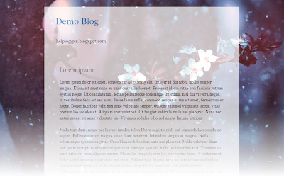
In the previous post we saw how to make the blog's background fill the screen regardless of the resolution of the monitor. The method that we'll use now with jQuery is a plugin called BackStretch which also has the option of creating a slideshow of pictures as a blog wallpaper without losing the property of adjusting to the width and height of the screen.

slideshow for blogger, blogger widgets

What we will do in this entry is just this, try to make the blog's background to have some images that are changing, all with fade effect between each transition.

You can see an example in this demo blog.

To put this slideshow in the blog's background, just go to Template - Edit HTML and before </head> add the following code:
<script src='http://ajax.googleapis.com/ajax/libs/jquery/1.10.2/jquery.min.js' type='text/javascript'/>
<script>
//<![CDATA[
/*
* jQuery Backstretch
* Version 1.2.8
* http://srobbin.com/jquery-plugins/jquery-backstretch/
* Add a dynamically-resized background image to the page
* Copyright (c) 2012 Scott Robbin (srobbin.com)
* Licensed under the MIT license
* https://raw.github.com/srobbin/jquery-backstretch/master/LICENSE.txt
*/
;(function(a){a.backstretch=function(p,b,l){function s(){if(p){var b;0==c.length?c=a("<div />").attr("id","backstretch").css({left:0,top:0,position:m?"fixed":"absolute",overflow:"hidden",zIndex:-999999,margin:0,padding:0,height:"100%",width:"100%"}):c.find("img").addClass("deleteable");b=a("<img />").css({position:"absolute",display:"none",margin:0,padding:0,border:"none",zIndex:-999999,maxWidth:"none"}).bind("load",function(d){var b=a(this),e;b.css({width:"auto",height:"auto"});e=this.width||a(d.target).width();d=this.height||a(d.target).height();n=e/d;q();b.fadeIn(g.speed,function(){c.find(".deleteable").remove();"function"==typeof l&&l()})}).appendTo(c);0==a("body #backstretch").length&&(0===a(window).scrollTop()&&window.scrollTo(0,0),a("body").append(c));c.data("settings",g);b.attr("src",p);a(window).unbind("resize.backstretch").bind("resize.backstretch",function(){"onorientationchange"in window&&window.pageYOffset===0&&window.scrollTo(0,1);q()})}}function q(){try{j={left:0,top:0},rootWidth=h=o.width(),rootHeight=r?window.innerHeight:o.height(),f=h/n,f>=rootHeight?(k=(f-rootHeight)/2,g.centeredY&&(j.top="-"+k+"px")):(f=rootHeight,h=f*n,k=(h-rootWidth)/2,g.centeredX&&(j.left="-"+k+"px")),c.css({width:rootWidth,height:rootHeight}).find("img:not(.deleteable)").css({width:h,height:f}).css(j)}catch(a){}}var t={centeredX:!0,centeredY:!0,speed:0},c=a("#backstretch"),g=c.data("settings")||t;c.data("settings");var o,m,r,n,h,f,k,j;b&&"object"==typeof b&&a.extend(g,b);b&&"function"==typeof b&&(l=b);a(document).ready(function(){var b=window,d=navigator.userAgent,c=navigator.platform,e=d.match(/AppleWebKit\/([0-9]+)/),e=!!e&&e[1],f=d.match(/Fennec\/([0-9]+)/),f=!!f&&f[1],g=d.match(/Opera Mobi\/([0-9]+)/),h=!!g&&g[1],i=d.match(/MSIE ([0-9]+)/),i=!!i&&i[1];o=(m=!((-1<c.indexOf("iPhone")||-1<c.indexOf("iPad")||-1<c.indexOf("iPod"))&&e&&534>e||b.operamini&&"[object OperaMini]"==={}.toString.call(b.operamini)||g&&7458>h||-1<d.indexOf("Android")&&e&&533>e||f&&6>f||"palmGetResource"in window&&e&&534>e||-1<d.indexOf("MeeGo")&&-1<d.indexOf("NokiaBrowser/8.5.0")||i&&6>=i))?a(window):a(document);r=m&&window.innerHeight;s()});return this}})(jQuery);
//]]>
</script>
<script>
//<![CDATA[
var images = [
 "Image URL",
 "Image URL",
 "Image URL",
 "Image URL",
 "Image URL",
  ];

  $(images).each(function(){
 $('<img/>')[0].src = this;
  });
  var index = 0;
$.backstretch(images[index], {speed: 1000});
  var slideshow = setInterval(function() {
  index = (index >= images.length - 1) ? 0 : index + 1;
    $.backstretch(images[index]);
  }, 5000);
//]]>
</script>
Here add the URLs of the images that will be the background of your blog.
If you would like to add more pictures, just add after the var images = [ another line like this:
 "Image URL",
The images will be changing in the order you have added them, if you want these to appear in a random order, then change the second part of the code with this:
<script>
//<![CDATA[
var images=new Array();
images[ 1 ]="Image URL";
images[ 2 ]="Image URL";
images[ 3 ]="Image URL";
images[ 4 ]="Image URL";
images[ 5 ]="Image URL";

  Array.prototype.shuffle = function() {
  var len = this.length;
  var i = len;
  while (i--) {
  var p = parseInt(Math.random()*len);
  var t = this[i];
  this[i] = this[p];
  this[p] = t;
  }
};

  images.shuffle();
  $(images).each(function(){
 $('<img/>')[0].src = this;
  });
  var index = 0;
$.backstretch(images[index], {speed: 1000});
  var slideshow = setInterval(function() {
  index = (index >= images.length - 1) ? 0 : index + 1;
    $.backstretch(images[index]);
  }, 5000);
//]]>
</script>
You can also add more pictures by adding a line like this:
images[ 6 ]="Image URL";
But you will see that in this case there are some consecutive numbers in blue, so if you add another such as 6, then the next one should be 7, etc..

In both cases you can change the duration of each image which is in the 5000 value that is at the end of the script.
The advantage of this slideshow in the blog's background is that images are automatically resized to the size of the monitor, so that, no matter of the resolution, it should look good.

It is worth remembering that if you are using Scriptaculous, you have to make some changes, and if you already use jQuery, should leave only one version.

Author page | Backstretch
More aboutCreate a Background Slideshow for Blogger

Rounded Corners and Shadows for Images using CSS

Posted by Unknown

Here are some unique border styles that you can apply to blogger images by using the border-radius property and defining either all four corners simultaneously or applying the rounded border only to some of them.

One of the advantages of CSS3 is that we can apply rounded borders without complicating things too much and one of the options would be to use these edges or borders to images in the blog posts, to which we can also add some hover effects such as shading and rounded borders accompanied by transitions.

Note: if you need more info about how to add rounded corners on images, follow these links:
- CSS Basics. How to Apply Rounded Corners On Images #1
- CSS Basics. How to Apply Rounded Corners On Images #2

Below are a few examples of these borders and how the images behave when you hover over them.
If you want to use one of these styles, just copy the code below the image, then go to Template, click on the Edit HTML button and paste that code before ]]></b:skin> (CTRL + F to find it)
.post-body img {
border:0;
padding:0;
-moz-transition: all 1s;
-webkit-transition: all 1s;
-o-transition: all 1s;
}
.post-body img:hover {
box-shadow: 0px 0px 15px #000; /* Shadow */
border-radius: 50%; /* Rounded border */
-moz-transition: all 1s;
-webkit-transition: all 1s;
-o-transition: all 1s;
cursor:pointer;
}
.post-body img {
background:#FFF; /* background color around the image */
padding:15px; /* space between border and image */
-moz-transition: all 1s;
-webkit-transition: all 1s;
-o-transition: all 1s;
}
.post-body img:hover {
box-shadow: 0px 0px 15px #000; /* Shadow */
border-radius: 0% 50%; /* Rounded border */
-moz-transition: all 1s;
-webkit-transition: all 1s;
-o-transition: all 1s;
cursor:pointer;
}
.post-body img {
background:#FFF; /* the background color around the image */
padding:15px; /* The Space Between Border and Image */
border-radius: 50% 0; /* Rounded border */
box-shadow: 0px 0px 15px #000; /* Shadow */
-moz-transition: all 1s;
-webkit-transition: all 1s;
-o-transition: all 1s;
}
.post-body img:hover {
border-radius:0; /* This removes the border roundness (value 0) */
-moz-transition: all 1s;
-webkit-transition: all 1s;
-o-transition: all 1s;
cursor:pointer;
}
.post-body img {
box-shadow: 0px 0px 15px #000; /* Shadow */
border-radius: 50%; /* Rounded border */
border:0;
padding:0;
-moz-transition: all 1s;
-webkit-transition: all 1s;
-o-transition: all 1s;
}
.post-body img:hover {
box-shadow: 0; /* With this we remove the shadow (value 0) */
border-radius: 0; /* This removes the border roundness (value 0) */
-moz-transition: all 1s;
-webkit-transition: all 1s;
-o-transition: all 1s;
cursor:pointer;
}
.post-body img {
border-radius: 45% / 20%; /* Rounded border */
box-shadow: 0px 0px 15px #000; /* Shadow */
padding:0;
-moz-transition: all 1s;
-webkit-transition: all 1s;
-o-transition: all 1s;
}
.post-body img:hover {
border-radius: 0; /* This removes the roundness of border (value 0) */
-moz-transition: all 1s;
-webkit-transition: all 1s;
-o-transition: all 1s;
cursor:pointer;
}
So these effects will apply to all images uploaded to your Blogger posts. But if you want to apply them only on certain pictures then change .post-body img with .rounded  and .post-body img:hover with .rounded:hover
Then add the rounded class selector in the image's code:
<img class="rounded" src="Image URL"/>
These are just some examples, however, you can modify them anytime by adding or deleting more CSS styles, it depends on everybody's tastes or needs. But as you have seen, we can make the images look way more attractive and this has been done only with CSS ;)
More aboutRounded Corners and Shadows for Images using CSS

How to make the background image of the blog fill the entire screen

Posted by Unknown

A constant question is how to make the background image of the blog always fill the entire screen regardless of the resolution of the monitor. And that is when we put a background image as measured by our monitor forgetting that there are actually monitors of all resolutions, very small and very large. So if we put an image according to our screen, there will be someone with a bigger monitor that surely will not see the whole picture or it will be repeated, and in this case, using very small monitors, the image will be seen incomplete.
blogger tricks, blogger tutorials, blogger blogspot

Here I will discuss two solutions to this, one using CSS3, and another with jQuery. With either of these two, we'll make the background image of the page to fill the entire screen regardless of the resolution of it.

CSS3


The first option is using CSS3, the advantage with this method is that we do not overload the blog with scripts, we use only the background-size property that is responsible for conducting what we want.
The disadvantage is that this property is supported only by modern browsers, so in the case of Internet Explorer, it will only be seen for version 9 and above, in other browsers there should be no problem.

The method is very simple, just go to Template - Edit HTML, locate the background that is within body { and replace it with this:
background: url(Image URL) no-repeat center center fixed;
background-size: cover;
It would look something like this:
body {
background: url(URL of the image) no-repeat center center fixed;
background-size: cover;
margin:0;
color:#000;
font:x-small Georgia Serif;
font-size/* */:/**/small;
font-size: /**/small;
text-align: center;
}
Just put the URL of the image and that's it.

jQuery


With this method we will use jQuery with BackStretch plugin, the advantage is that it works in all browsers, including IE7 and above. The disadvantage is not major if you already use jQuery, because the plugin is actually small.

To use this method in your blog, go to Template - Edit HTML and before </head> paste this script:
<script src='http://ajax.googleapis.com/ajax/libs/jquery/1.10.2/jquery.min.js' type='text/javascript'/>
<script type='text/javascript'>
//<![CDATA[
/*
* jQuery Backstretch
* Version 1.2.8
* http://srobbin.com/jquery-plugins/jquery-backstretch/
* Add a dynamically-resized background image to the page
* Copyright (c) 2012 Scott Robbin (srobbin.com)
* Licensed under the MIT license
* https://raw.github.com/srobbin/jquery-backstretch/master/LICENSE.txt
*/
;(function(a){a.backstretch=function(p,b,l){function s(){if(p){var b;0==c.length?c=a("<div />").attr("id","backstretch").css({left:0,top:0,position:m?"fixed":"absolute",overflow:"hidden",zIndex:-999999,margin:0,padding:0,height:"100%",width:"100%"}):c.find("img").addClass("deleteable");b=a("<img />").css({position:"absolute",display:"none",margin:0,padding:0,border:"none",zIndex:-999999,maxWidth:"none"}).bind("load",function(d){var b=a(this),e;b.css({width:"auto",height:"auto"});e=this.width||a(d.target).width();d=this.height||a(d.target).height();n=e/d;q();b.fadeIn(g.speed,function(){c.find(".deleteable").remove();"function"==typeof l&&l()})}).appendTo(c);0==a("body #backstretch").length&&(0===a(window).scrollTop()&&window.scrollTo(0,0),a("body").append(c));c.data("settings",g);b.attr("src",p);a(window).unbind("resize.backstretch").bind("resize.backstretch",function(){"onorientationchange"in window&&window.pageYOffset===0&&window.scrollTo(0,1);q()})}}function q(){try{j={left:0,top:0},rootWidth=h=o.width(),rootHeight=r?window.innerHeight:o.height(),f=h/n,f>=rootHeight?(k=(f-rootHeight)/2,g.centeredY&&(j.top="-"+k+"px")):(f=rootHeight,h=f*n,k=(h-rootWidth)/2,g.centeredX&&(j.left="-"+k+"px")),c.css({width:rootWidth,height:rootHeight}).find("img:not(.deleteable)").css({width:h,height:f}).css(j)}catch(a){}}var t={centeredX:!0,centeredY:!0,speed:0},c=a("#backstretch"),g=c.data("settings")||t;c.data("settings");var o,m,r,n,h,f,k,j;b&&"object"==typeof b&&a.extend(g,b);b&&"function"==typeof b&&(l=b);a(document).ready(function(){var b=window,d=navigator.userAgent,c=navigator.platform,e=d.match(/AppleWebKit\/([0-9]+)/),e=!!e&&e[1],f=d.match(/Fennec\/([0-9]+)/),f=!!f&&f[1],g=d.match(/Opera Mobi\/([0-9]+)/),h=!!g&&g[1],i=d.match(/MSIE ([0-9]+)/),i=!!i&&i[1];o=(m=!((-1<c.indexOf("iPhone")||-1<c.indexOf("iPad")||-1<c.indexOf("iPod"))&&e&&534>e||b.operamini&&"[object OperaMini]"==={}.toString.call(b.operamini)||g&&7458>h||-1<d.indexOf("Android")&&e&&533>e||f&&6>f||"palmGetResource"in window&&e&&534>e||-1<d.indexOf("MeeGo")&&-1<d.indexOf("NokiaBrowser/8.5.0")||i&&6>=i))?a(window):a(document);r=m&&window.innerHeight;s()});return this}})(jQuery);
//]]>
</script>
<script>
$.backstretch("URL of the image");
</script>

Put the URL of the image where indicated and ready.

As you can see both systems are easy to apply, each with its pros and cons, but the result is the same, extending the background image to fit the screen of any monitor regardless of the resolution of it.

Remember that in the case of jQuery method, you should verify that you are not using Mootools or Scriptaculous, if so you will have to implement some changes in the script to make it compatible.
And if you already use jQuery remember having only one version, the last one.
More aboutHow to make the background image of the blog fill the entire screen

Vertical drop down menu with jQuery

Posted by Unknown

jGlideMenu is a vertical menu that can be dragged and dropped so that the reader can place it anywhere, and in addition, he can browse through the tabs in a very peculiar manner that comes with a sliding effect giving a sexy touch.

One of the advantages is that it can store a large number of links and can be removed anytime if we want.

vertical menu, menu for blogger

To understand this menu better and to see it in action, visit this demo blog. There we can drag the menu, navigate through its tabs or close.

To add this vertical menu on your blog, just follow these steps:

1) From your Blogger dashboard, go to Template > Edit HTML and before the </head> tag, add these scripts:
<script src='http://ajax.googleapis.com/ajax/libs/jquery/1.7.1/jquery.min.js' type='text/javascript'/>
<script src='http://ajax.googleapis.com/ajax/libs/jqueryui/1.7.1/jquery-ui.min.js' type='text/javascript'/>
<script src='http://fe-blogger.googlecode.com/svn/trunk/jQuery.jGlideMenu.min.js' type='text/javascript'/>

<script type='text/javascript'>
//<![CDATA[
$(document).ready(function(){
$('#jGlide_001').jGlideMenu({
tileSource : '.jGlide_001_tiles' ,
demoMode : false
}).show();

$('#switch').click(function(){$(this).jGlideMenuToggle();});
});
//]]>
</script>
2) Now paste before ]]></b:skin> these styles:
.jGM_box {
position: absolute; /* Change absolute with fixed if you want it to float */
top: 50px; /* Distance from above */
right: 760px; /* Distance from right */
width: 227px;
height: 317px;
background: #fff; /* Background color */
margin: 0;
padding: 0;
border: 1px solid #ccc; /* Border */
overflow: hidden;
}
.jGM_header {
position: absolute;
top: 0;
left: 0;
height: 18px;
width: 227px;
background: #d1d1d1; /* Background color for the up bar */
color: #fff;
text-align: right;
vertical-align: middle;
line-height: 18px;
cursor: move;
}
.jGM_header a {
margin-right: 12px;
text-decoration: none;
color: #000 !important;
cursor: pointer;
}
.jGM_wrapper {
position: absolute;
top: 19px;
left: 0;
width: 2270px;
height: 288px;
margin: 0;
padding: 0;
border: 0;
}
.jGM_tile {
position: absolute;
top: 0;
left: 7px;
width: 213px;
height: auto;
overflow: hidden;
margin: 0;
padding: 0;
border: 0;
display: block;
}
.jGM_cats {
width: 100%;
height: 64px;
overflow: hidden;
vertical-align: middle;
text-align: left;
}
.jGM_cats h4 {
font-family: Verdana,Arial,serif;
font-size: 1.8em;
margin: 0;
padding: 2px 0;
line-height: 1.8em;
color: #414141;
font-weight: normal;
}
.jGM_cats p {
font-family: Verdana,tahoma,arial;
font-size: 1em; /* Font size of the description */
margin: 0;
padding: 0;
line-height: 1.2em;
color: #858585; /* Description color */
font-weight: normal;
}
.jGM_pager {
height: 18px;
width: 213px;
line-height: 18px;
margin: 0;
border: 0;
padding: 0;
background: #f6f6f6;
text-align: center;
vertical-align: middle;
}
.jGM_pager a {
text-decoration: none;
font-weight: bold;
text-decoration: none;
display: block;
}
.jGM_pager a:hover { background: #d1d1d1; }
.jGM_pager img { border: 0; margin: 6px 0; }
.jGM_content {
width: 213px;
height: 150px;
margin: 1px 0;
padding: 0;
border: 0;
overflow: hidden;
}
.jGM_content a {
font-family: Tahoma,arial;
text-decoration: none;
color: #333 !important;
height: 18px;
width: 100%;
display: block;
line-height: 18px;
padding: 0 0 0 10px;
background-color: #e6e7e9;
margin: 1px 0;
}
.jGM_content a:hover {
color: #fff !important;
background-color: #4D4E67; /* Bar color on mouseover */
}
.jGM_more {
background-image: url(https://blogger.googleusercontent.com/img/b/R29vZ2xl/AVvXsEg_lebENDZnVXG3xgZH1It8TU5tHxtaAEoLQgVgrKtddwbS53BE_uDRgnQSHAcfJthiQf13VkDlqcxrCSXMToWnLrknJJn0jHkPPXcFDX_rYDekqsdbng6DcewVt4c0J3vt8d77saGH1ZE/s1600/arrow.gif);
background-repeat: no-repeat;
background-position: 203px 50%;
}
.jGM_back {
position: absolute;
top: 255px;
right: 0;
height: 18px;
width: 52px;
background: #d1d1d1;
line-height: 18px;
vertical-align: middle;
text-align: center;
margin: 10px 0 0 0;
padding: 0;
border: 0;
z-index: 99;
}
.jGM_back a {
height: 100%;
width: 100%;
text-decoration: none;
color: #000 !important; /* Color of the "Back" link */
display: block;
}
.jGM_back a:hover {
color: #fff !important; /* Color of the "Back" link on mouseover */
background: #4D4E67;
}
.jGM_reset {
position: absolute;
top: 255px;
right: 62px;
height: 18px;
width: 52px;
background: #d1d1d1;
line-height: 18px;
vertical-align: middle;
text-align: center;
margin: 10px 0 0 0;
padding: 0;
border: 0;
z-index: 99;
}
.jGM_reset a {
height: 100%;
width: 100%;
text-decoration: none;
color: #000 !important; /* Color of the "Home" link */
display: block;
}
.jGM_reset a:hover {
color: #fff !important; /* Color of the "Home" link on mouseover */
background: #4D4E67;
}
3) Now go to Layout and paste the structure of the menu inside a HTML/Javascript gadget:
<div class="jGM_box" id="jGlide_001">

<!-- Here all the links of the first level -->
<ul id="tile_001" class="jGlide_001_tiles" title="Menu" alt="Description of the first level">
<li rel="tile_002">Link 1</li>
<li rel="tile_003">Link 2</li>
<li rel="tile_004">Link 3</li>
<li rel="tile_006">Link 4</li>
<li rel="tile_007">Link 5</li>
<li><a href="URL address">Link 6</a></li>
<li><a href="URL address">Link 7</a></li>
<li><a href="URL address">Link 8</a></li>
<li><a href="URL address">Link 9</a></li>
<li><a href="URL address">Link 10</a></li>
<li><a href="URL address">Link 11</a></li>
</ul>

<!-- Here all the links of the second level -->
<ul id="tile_002" class="jGlide_001_tiles" title="Menu" alt="Description of the second level">
<li rel="tile_005">Link 1.1</li>
<li><a href="URL address">Link 1.2</a></li>
<li><a href="URL address">Link 1.3</a></li>
<li><a href="URL address">Link 1.4</a></li>
</ul>

<ul id="tile_003" class="jGlide_001_tiles" title="Menu" alt="Description of the second level">
<li><a href="URL address">Link 2.1</a></li>
<li rel="tile_008">Link 2.2</li>
<li><a href="URL address">Link 2.3</a></li>
</ul>

<ul id="tile_004" class="jGlide_001_tiles" title="Menu" alt="Description of the second level">
<li><a href="URL address">Link 3.1</a></li>
<li><a href="URL address">Link 3.2</a></li>
<li><a href="URL address">Link 3.3</a></li>
</ul>


<ul id="tile_006" class="jGlide_001_tiles" title="Menu" alt="Description of the second level">
<li><a href="URL address">Link 4.1</a></li>
<li><a href="URL address">Link 4.2</a></li>
<li><a href="URL address">Link 4.3</a></li>
</ul>

<ul id="tile_007" class="jGlide_001_tiles" title="Menu" alt="Description of the second level">
<li><a href="URL address">Link 5.1</a></li>
<li><a href="URL address">Link 5.2</a></li>
</ul>


<!-- Here all the links of the third level -->
<ul id="tile_005" class="jGlide_001_tiles" title="Menu" alt="Description of the third level">
<li><a href="URL address">Link 1.1.1</a></li>
<li><a href="URL address">Link 1.1.2</a></li>
</ul>


<ul id="tile_008" class="jGlide_001_tiles" title="Menu" alt="Description of the third level">
<li><a href="URL address">Link 1.2.1</a></li>
<li><a href="URL address">Link 1.2.2</a></li>
</ul>

</div>
Add the URLs of the links and the names of the tabs and that's it.
If you want to add more links to the first level, then add another line like this:
<li><a href="URL address">Link 12</a></li>
If you want to add another level to the link, then the line should be like this:
<li rel="tile_0010">Link 5</li>
Then in the area of ​​the second or third level, add a piece like this:
<ul id="tile_0010" class="jGlide_001_tiles" title="Menu" alt="Description of the second level">
<li><a href="URL address">Link 5.1</a></li>
<li><a href="Url address">Link 5.2</a></li>
</ul>
Here you should keep something in mind, if you look closely the link takes the REL attribute which must be the same as the ID we put on the second level, these IDs should not repeat and always be unique.
Yes, it sounds complicated, but once you understand the concept, you'll see that is actually pretty simple.

In the area of ​​the styles, there are the parts that can be customized. If you want the menu to be static, let's say you want to add it in the sidebar, then delete the first code of the script that is in italics. And in the CSS styles, remove this part:
position: absolute; /* Change absolute with fixed if you want it to float */
top: 50px; /* Distance above */
right: 760px; /* Distance to the right */
When there are many links then, there will be showing some arrows, so when you mouseover them, it will show the rest of the links either up or down.

Throughout the menu structure we can change the Menu name and the descriptions as well.

As this menu is made with JQuery, it is recommended to verify to have only one version of it.
More aboutVertical drop down menu with jQuery

How to embed a youtube playlist on your blogger blog

Posted by Unknown

In this post we will see how to create a YouTube video gallery using jQuery. It is an elegant gallery in which we can add 5 videos and for its dimensions, we could put it below the blog header. Actually you can put it anywhere, but it is recommended in that area considering that 765px is the width of the gallery.

youtube to blogger
To add this video slider to your blog go to Template > Edit HTML and before the </head> tag, add these scripts:

<script>
//<![CDATA[
/*hoverscroll v.0.2.4*/
(function($) {
$.fn.hoverscroll = function(params) {
if (!params) { params = {}; }
params = $.extend({}, $.fn.hoverscroll.params, params);
this.each(function() {
var $this = $(this);
if (params.debug) {$.log('[HoverScroll] Trying to create hoverscroll on element ' + this.tagName + '#' + this.id);}
if (params.fixedArrows) {
$this.wrap('<div class="fixed-listcontainer"></div>')
}
else {
$this.wrap('<div class="listcontainer"></div>');
}

$this.addClass('list');
var listctnr = $this.parent();
listctnr.wrap('<div class="ui-widget-content hoverscroll' +
(params.rtl && !params.vertical ? " rtl" : "") + '"></div>');
//listctnr.wrap('<div class="hoverscroll"></div>');

var ctnr = listctnr.parent();

var leftArrow, rightArrow, topArrow, bottomArrow;
if (params.arrows) {
if (!params.vertical) {
if (params.fixedArrows) {
leftArrow = '<div class="fixed-arrow left"></div>';
rightArrow = '<div class="fixed-arrow right"></div>';

listctnr.before(leftArrow).after(rightArrow);
}
else {
leftArrow = '<div class="arrow left"></div>';
rightArrow = '<div class="arrow right"></div>';

listctnr.append(leftArrow).append(rightArrow);
}
}
else {
if (params.fixedArrows) {
topArrow = '<div class="fixed-arrow top"></div>';
bottomArrow = '<div class="fixed-arrow bottom"></div>';

listctnr.before(topArrow).after(bottomArrow);
}
else {
topArrow = '<div class="arrow top"></div>';
bottomArrow = '<div class="arrow bottom"></div>';

listctnr.append(topArrow).append(bottomArrow);
}
}
}
ctnr.width(params.width).height(params.height);

if (params.arrows && params.fixedArrows) {
if (params.vertical) {
topArrow = listctnr.prev();
bottomArrow = listctnr.next();

listctnr.width(params.width)
.height(params.height - (topArrow.height() + bottomArrow.height()));
}
else {
leftArrow = listctnr.prev();
rightArrow = listctnr.next();

listctnr.height(params.height)
.width(params.width - (leftArrow.width() + rightArrow.width()));
}
}
else {
listctnr.width(params.width).height(params.height);
}

var size = 0;

if (!params.vertical) {
ctnr.addClass('horizontal');
$this.children().each(function() {
$(this).addClass('item');

if ($(this).outerWidth) {
size += $(this).outerWidth(true);
}
else {
size += $(this).width() + parseInt($(this).css('padding-left')) + parseInt($(this).css('padding-right'))
+ parseInt($(this).css('margin-left')) + parseInt($(this).css('margin-right'));
}
});
$this.width(size);

if (params.debug) {
$.log('[HoverScroll] Computed content width : ' + size + 'px');
}
if (ctnr.outerWidth) {
size = ctnr.outerWidth();
}
else {
size = ctnr.width() + parseInt(ctnr.css('padding-left')) + parseInt(ctnr.css('padding-right'))
+ parseInt(ctnr.css('margin-left')) + parseInt(ctnr.css('margin-right'));
}

if (params.debug) {
$.log('[HoverScroll] Computed container width : ' + size + 'px');
}
}
else {
ctnr.addClass('vertical');
$this.children().each(function() {
$(this).addClass('item')

if ($(this).outerHeight) {
size += $(this).outerHeight(true);
}
else {
size += $(this).height() + parseInt($(this).css('padding-top')) + parseInt($(this).css('padding-bottom'))
+ parseInt($(this).css('margin-bottom')) + parseInt($(this).css('margin-bottom'));
}
});
$this.height(size);

if (params.debug) {
$.log('[HoverScroll] Computed content height : ' + size + 'px');
}
if (ctnr.outerHeight) {
size = ctnr.outerHeight();
}
else {
size = ctnr.height() + parseInt(ctnr.css('padding-top')) + parseInt(ctnr.css('padding-bottom'))
+ parseInt(ctnr.css('margin-top')) + parseInt(ctnr.css('margin-bottom'));
}

if (params.debug) {
$.log('[HoverScroll] Computed container height : ' + size + 'px');
}
}
var zone = {
1: {action: 'move', from: 0, to: 0.06 * size, direction: -1 , speed: 16},
2: {action: 'move', from: 0.06 * size, to: 0.15 * size, direction: -1 , speed: 8},
3: {action: 'move', from: 0.15 * size, to: 0.25 * size, direction: -1 , speed: 4},
4: {action: 'move', from: 0.25 * size, to: 0.4 * size, direction: -1 , speed: 2},
5: {action: 'stop', from: 0.4 * size, to: 0.6 * size},
6: {action: 'move', from: 0.6 * size, to: 0.75 * size, direction: 1 , speed: 2},
7: {action: 'move', from: 0.75 * size, to: 0.85 * size, direction: 1 , speed: 4},
8: {action: 'move', from: 0.85 * size, to: 0.94 * size, direction: 1 , speed: 8},
9: {action: 'move', from: 0.94 * size, to: size, direction: 1 , speed: 16}
}

ctnr[0].isChanging = false;
ctnr[0].direction = 0;
ctnr[0].speed = 1;
function checkMouse(x, y) {
x = x - ctnr.offset().left;
y = y - ctnr.offset().top;

var pos;
if (!params.vertical) {pos = x;}
else {pos = y;}

for (i in zone) {
if (pos >= zone[i].from && pos < zone[i].to) {
if (zone[i].action == 'move') {startMoving(zone[i].direction, zone[i].speed);}
else {stopMoving();}
}
}
}

function setArrowOpacity() {
if (!params.arrows || params.fixedArrows) {return;}

var maxScroll;
var scroll;

if (!params.vertical) {
maxScroll = listctnr[0].scrollWidth - listctnr.width();
scroll = listctnr[0].scrollLeft;
}
else {
maxScroll = listctnr[0].scrollHeight - listctnr.height();
scroll = listctnr[0].scrollTop;
}
var limit = params.arrowsOpacity;
var opacity = (scroll / maxScroll) * limit;

if (opacity > limit) { opacity = limit; }
if (isNaN(opacity)) { opacity = 0; }

var done = false;
if (opacity <= 0) {
$('div.arrow.left, div.arrow.top', ctnr).hide();
if(maxScroll > 0) {
$('div.arrow.right, div.arrow.bottom', ctnr).show().css('opacity', limit);
}
done = true;
}
if (opacity >= limit || maxScroll <= 0) {
$('div.arrow.right, div.arrow.bottom', ctnr).hide();
done = true;
}

if (!done) {
$('div.arrow.left, div.arrow.top', ctnr).show().css('opacity', opacity);
$('div.arrow.right, div.arrow.bottom', ctnr).show().css('opacity', (limit - opacity));
}
}

function startMoving(direction, speed) {
if (ctnr[0].direction != direction) {
if (params.debug) {
$.log('[HoverScroll] Starting to move. direction: ' + direction + ', speed: ' + speed);
}

stopMoving();
ctnr[0].direction = direction;
ctnr[0].isChanging = true;
move();
}
if (ctnr[0].speed != speed) {
if (params.debug) {
$.log('[HoverScroll] Changed speed: ' + speed);
}

ctnr[0].speed = speed;
}
}

function stopMoving() {
if (ctnr[0].isChanging) {
if (params.debug) {
$.log('[HoverScroll] Stoped moving');
}

ctnr[0].isChanging = false;
ctnr[0].direction = 0;
ctnr[0].speed = 1;
clearTimeout(ctnr[0].timer);
}
}

function move() {
if (ctnr[0].isChanging == false) {return;}

setArrowOpacity();

var scrollSide;
if (!params.vertical) {scrollSide = 'scrollLeft';}
else {scrollSide = 'scrollTop';}

listctnr[0][scrollSide] += ctnr[0].direction * ctnr[0].speed;
ctnr[0].timer = setTimeout(function() {move();}, 50);
}

if (params.rtl && !params.vertical) {
listctnr[0].scrollLeft = listctnr[0].scrollWidth - listctnr.width();
}

ctnr
.mousemove(function(e) {checkMouse(e.pageX, e.pageY);})
.bind('mouseleave', function() {stopMoving();});

this.startMoving = startMoving;
this.stopMoving = stopMoving;

if (params.arrows && !params.fixedArrows) {
// Initialise arrow opacity
setArrowOpacity();
}
else {
// Hide arrows
$('.arrowleft, .arrowright, .arrowtop, .arrowbottom', ctnr).hide();
}
});

return this;
};

if (!$.fn.offset) {
$.fn.offset = function() {
this.left = this.top = 0;

if (this[0] && this[0].offsetParent) {
var obj = this[0];
do {
this.left += obj.offsetLeft;
this.top += obj.offsetTop;
} while (obj = obj.offsetParent);
}

return this;
}
}

$.fn.hoverscroll.params = {
vertical: false,
width: 400,
height: 50,
arrows: true,
arrowsOpacity: 0.7,
fixedArrows: false,
rtl: false,
debug: false
};
$.log = function() {
try {console.log.apply(console, arguments);}
catch (e) {
try {opera.postError.apply(opera, arguments);}
catch (e) {}
}
};
})(jQuery);

$(function(){
$("#videoslider-tabs a").click(function(){
var container = $("#videoslider-content");
container.html("<img src='https://blogger.googleusercontent.com/img/b/R29vZ2xl/AVvXsEjZ8WvS7nX3jeCGP2EB_Ua6aMee4gsev32TulenPcliPeHirYHD-iv1mqg9bf7LQhLhIyHeQaXQcd6qhOSib506zkAaft1LOddeqwInAN4w81BDKo1QZCR5kILXbs1g3KrQzdtbzVDuN_jC/s1600/loading.png' class='loading-vid' />");
var id = $(this).attr("href").slice(1);
loadvideo(id);
return false;
});
$("#videoslider-tabs").hoverscroll({vertical:true,width:300,height:330,arrows:false});
$("#videoslider-tabs li").hover(function(){$(this).addClass("hover");},function(){$(this).removeClass("hover");});
loadvideo();
});

function loadvideo (hash){if(hash){hash = hash.slice(3);$("#videoslider-content").html(video[hash]);$("#videoslider-tabs li").removeClass("actVid");$("#videoslider-tabs a[href=#vid"+hash+"]").parent().addClass("actVid");}else{$("#videoslider-content").html(video[1]);$("#videoslider-tabs li").removeClass("actVid");$("#videoslider-tabs a[href=#vid1]").parent().addClass("actVid");}}
//]]>
</script>

Then add the styles before ]]></b:skin>

/* Video Gallery for Blogger
----------------------------------------------- */
#videoslider {
background:#000; /* Background color */
clear:both;
margin:0 auto;
padding:5px;
width:765px;
border-radius: 5px;
-moz-background-clip: padding;
-webkit-background-clip: padding-box;
background-clip: padding-box;
}
#videoslider, #videoslider-content, #videoslider-tabs {height:350px;overflow:hidden;}
#videoslider-content {color:#fff;float:left;text-align:center;width:460px;z-index:1;}
.loading-vid {display:block;margin:165px auto 0;}
#videoslider-tabs {float:right;width:300px;margin:0;}
#videoslider-tabs li {background:url(https://blogger.googleusercontent.com/img/b/R29vZ2xl/AVvXsEjP-26RqusJ6wUzHFPgCCvP7ShSDzGFrVW8Tzo07cY_E6m7JEldHByC6mj2espO46_UQYmjpLpSSXIrmaOaBSrQ3c6dTrmyrZM71T_g7EnY2MTmoRHKpT16w_9qyAoAAXNZp0vMB3B97uJT/s1600/tab_backgr.jpeg) repeat-x top left;float:left;height:60px;padding:5px;width:290px;list-style:none;}
#videoslider-tabs li a {padding:0 !important;border:0 !important;}
#videoslider-tabs li.hover {background:#333;}
#videoslider-tabs li.actVid {background:#555;}
#videoslider-tabs li img.thumb-vid {background-color:#fff;float:left;height:52px;margin:0 8px 0 0;padding:5px;width:52px;}
#videoslider-tabs li span.vidTit {
display:block;
color:#CD332D; /* Titles color */
font-size:14px; /* Titles font size */
font-weight:bold;
text-decoration:none;
}
#videoslider-tabs li .vidDesc {
display:block;
color:#fff; /* Color of the description */
font-size:12px; /* Font size of the description */
font-weight:bold;
text-decoration:none;
}
#videoslider-tabs a {text-decoration:none;}
#videoslider-tabs li.actVid .vidDesc {color:#fff;}
.ui-widget-content{float:right;}
.tabs-outer {background-image: none !important;}
#videoslider-tabs li a:hover {background: none !important;}
Now in a HTML/Javascript gadget paste the structure of the slider, this is the one you should put under the header:
<script>
var video = [];
video[1] = '<iframe width="460" height="345" src="http://www.youtube.com/embed/video_ID_1" frameborder="0" allowfullscreen></iframe>';
video[2] = '<iframe width="460" height="345" src="http://www.youtube.com/embed/video_ID_2" frameborder="0" allowfullscreen></iframe>';
video[3] = '<iframe width="460" height="345" src="http://www.youtube.com/embed/video_ID_3" frameborder="0" allowfullscreen></iframe>';
video[4] = '<iframe width="460" height="345" src="http://www.youtube.com/embed/video_ID_4" frameborder="0" allowfullscreen></iframe>';
video[5] = '<iframe width="460" height="345" src="http://www.youtube.com/embed/video_ID_5" frameborder="0" allowfullscreen></iframe>';
</script>
<div id="videoslider">
<div id="videoslider-content"></div>
<ul id="videoslider-tabs">
<li><a href="#vid1"><img src="//i2.ytimg.com/vi/video_ID_1/default.jpg" class="thumb-vid" /><span class="vidTit">Video Name</span><span class="vidDesc">Video Description</span></a></li>

<li><a href="#vid2"><img src="//i2.ytimg.com/vi/video_ID_2/default.jpg" class="thumb-vid" /><span class="vidTit">Video Name</span><span class="vidDesc">Video Description</span></a></li>

<li><a href="#vid3"><img src="//i2.ytimg.com/vi/video_ID_3/default.jpg" class="thumb-vid" /><span class="vidTit">Video Name</span><span class="vidDesc">Video Description</span></a></li>

<li><a href="#vid4"><img src="//i2.ytimg.com/vi/video_ID_4/default.jpg" class="thumb-vid" /><span class="vidTit">Video Name</span><span class="vidDesc">Video Description</span></a></li>

<li><a href="#vid5"><img src="//i2.ytimg.com/vi/video_ID_5/default.jpg" class="thumb-vid" /><span class="vidTit">Video Name</span><span class="vidDesc">Video Description</span></a></li>

</ul>
</div>

Add the IDs of the videos, their names and their description and that's it. The description should be brief so you wont have space problems.
If you do not know how to get the ID of a video, then open the video on YouTube and look at the address bar... the last characters are the ID you need.


Note that the ID of each video should be added two times, one is for displaying the video and one for the tabs thumbnail.

As this gallery works with jQuery we should make sure to not repeat the version of the script if we already have jQuery.
More aboutHow to embed a youtube playlist on your blogger blog

Making a gadget visible only to the blog administrator

Posted by Unknown

And the post title says it all. There are gadgets that sometimes we want to be visible only to us and not to our blog readers, perhaps a Survey already ended that we want to keep, a counter, or any gadget that while we customize, we don't want anyone else to see until the final result is ready.
blogger widgets, blogger tutorials
 The procedure is simple, we just have to add two lines to our gadget that we want to hide.

First thing to do is to go to Template > Edit HTML and then search for the gadget's code we want to hide. It will be easier using the CTRL + F keys and locating the name of the gadget/widget.

For example, in a HTML/Javascript gadget, we will see a code like this:
<b:widget id='HTML1' locked='false' title='' type='HTML'>
<b:includable id='main'>
<span class='item-control blog-admin'>
<!-- only display title if it's non-empty -->
<b:if cond='data:title != &quot;&quot;'>
<h2 class='title'><data:title/></h2>
</b:if>
<div class='widget-content'>
<data:content/>
</div>

<b:include name='quickedit'/>
</span>
</b:includable>
</b:widget>
All you have to do is add the parts in red and ready. If you close the session go to your blog you'll not be able to view the gadget that you have hidden, but as soon as you sign in you will see that it is visible to you.

Not all gadgets have the same structure like in my example, but it will be easier to guide you, just place the first code in red just after <b:includable id='main'>

And the second red code just before </b:includable>
Note: to look inside the widget's code, click on the sideways arrow next to the widget's id.

And with that the gadget will be hidden for readers except you.
More aboutMaking a gadget visible only to the blog administrator

Upload images and get the URL of the image

Posted by Unknown

As each day there are lots of new users joining the world of blogging, is necessary to discuss about some basic topics that bring up some recurring questions such as how we could get the URL of an image?

On the Internet there are many both free as well as paid web hosting where we can host images, but since we use Blogger then there is nothing better than using the same hosting service that Google gives us and that is Picasa.

The fastest way to upload an image is by going to the Blogger post editor. From your Blogger Dashboard, go to your blog, then click on the New post button. And preferably from the Edit HTML tab, click on the image icon.

A pop-up window will open, then click on the Choose files button, browse for your image(s), double click or click on Open and then hit Add selected.

When you have uploaded you will see that in the post editor shows the code of the image.


That code is the URL of the image. You'll see two URLs (Web addresses):
<a href="https://blogger.googleusercontent.com/img/b/R29vZ2xl/AVvXsEhvnPM_0tVXHi0XoASooHDwckpH1YJK3hxj1U3gQWUBtCJazOoOlSEo-YO2Z34our5rzlB0yoeosYeEQ-rIM9DcXXjAA6qSHlST2JjMBJYOno3GyANl9nnPL7TATPusz6S9MQ6kX42pTl0k/s1600/Bliss-Windows-XP.png" imageanchor="1"><img border="0" src="https://blogger.googleusercontent.com/img/b/R29vZ2xl/AVvXsEhvnPM_0tVXHi0XoASooHDwckpH1YJK3hxj1U3gQWUBtCJazOoOlSEo-YO2Z34our5rzlB0yoeosYeEQ-rIM9DcXXjAA6qSHlST2JjMBJYOno3GyANl9nnPL7TATPusz6S9MQ6kX42pTl0k/s320/Bliss-Windows-XP.png" /></a>

The first is the URL of the image that you need to take. It is not necessary to publish this entry where you uploaded the picture, you could as well not publish it, leave it as a draft or delete it, the image will be saved anyway on PicasaWeb (unless when you removed the draft, you have also selected the image to remove). You could also upload image directly from Picasa. Just login to PicasaWeb, select the album where you want to host the image, and click on Add photos.


Select the image from your computer and upload it.


After we have uploaded, click on OK.

There you will see the thumbnail, along with other photos, if there are more.

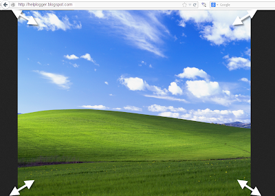
If you want to get the URL of the image from Picasa then click on the image to open in full size.
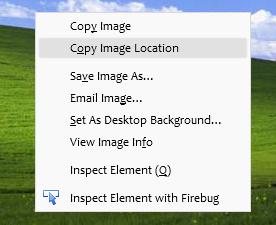
With the right mouse button click on the picture and select option depending on the browser you use...

If using Google Chrome, then select Copy Image URL:


If you are using Mozilla Firefox select Copy Image Location:


If you are using Opera select Copy Image URL:


If you are using Safari select Copy Image Address:


If you are using Internet Explorer (I hope not), first select Properties, a window will open, there you will find the Address section from where you can select the URL of the image and copy it:


Having selected any of these options you'll have in the clipboard the URL of the image. Simple isn't it?

Remember that all images you upload on Blogger are stored in your Picasa account, so if you find an image previously uploaded to your blog, go to your Picasa account, select the album containing the name of your blog and there find the picture you need. The procedure to obtain the URL of the image is the same as explained above.
More aboutUpload images and get the URL of the image

Possibly the most simple jQuery Slider

Posted by Unknown

Do you have jQuery in your blog and space to insert 10 lines of code? If the answer is yes and you also want to have an automatic slideshow, this is the simplest code I've seen so far.

That code having a succession of simple images placed inside a box with a common general container would give this result:


1. Adding the JavaScript

If you do not have jQuery, then you should add this line just after ]]></b:skin> to load this popular slideshow:
<script src='http://ajax.googleapis.com/ajax/libs/jquery/1.8/jquery.min.js' type='text/javascript'/>

Once confident that we have the library in our template, we need to add the same line to make the series of images function as a slider:
<script type="text/javascript">//<![CDATA[
$(function(){
    $('#slider div:gt(0)').hide();
    setInterval(function(){
      $('#slider div:first-child').fadeOut(0)
         .next('div').fadeIn(1000)
         .end().appendTo('#slider');}, 4000);
});
//]]></script>

We can save changes to the template because that is all. It is simple but you will see that it works and does what it has to do. Now we just have to put the images where we want to display, in the manner discussed below.

2. Create the slider

After adding the codes above in our template (although you could add it directly into a gadget, on a page or even in an entry as you see here) we can create a viewer as you saw above. We just have to use this HTML structure below to add the images:
<div id="slider">
    <div><img src="IMAGE_URL"/></div>
    <div><img src="IMAGE_URL"/></div>
    <div><img src="IMAGE_URL"/></div>
</div>

I do not know how you see it but it is all you need.

For me this is quite lightweight and efficient, much more than most libraries that are used perhaps too often.

Settings


The last three numbers of the plugin allow us to adjust some things. All are expressed in milliseconds (4000 = 4 seconds)

fadeOut(0): Time for the outgoing image
fadeIn(1000): Time for the next image
('#slider');},4000): Time spent in each image

How it Works


And for the curious who want to learn things...

$('#slider div:gt(0)').hide();
With gt(x) we select all the divs from number x. In this case 0 is the first, so what we do with this line is to hide (hide) all the boxes except the first, which will be the image visible initially.

setInterval(function(){ [what we will do] }, 4000);
We need to reiterate a few things from time to time and we do with setInterval, indicating the delay time between each set.

$('#slider div:first-child').fadeOut(0)
Within each of these intervals we remove (fadeOut) the first box (div:first-child) that is in the relationship of images...

.next('div').fadeIn(1000)
...and we make the following box (next) appearing gradually (fadeIn).

.end().appendTo('#slider');
Finally we have the first image and place it at the end (appendTo) of the "list".

end() resets the count of elements that we move forward with next(). Thus, the first child made earlier to disappear is the one we sent down the stack and not the image that is now visible.

Variants and customization


As you have seen CSS is not necessary for the slider to work, but using it we can change its look, allow the use of images of different sizes, include labels and even improve the transition. Here are some ideas.


DEMO TEXT1


DEMO TEXT2


DEMO TEXT3


We can limit the overall container size and prevent overflow for larger images. And then we will put rounded corners, border and then center them.
#slider {
overflow: hidden;
width: 500px;
height: 300px;
border:3px solid #b8b8b8;
border-radius: 40px;
margin: 0 auto;
padding: 0;
position: relative;
}

If we place the parent boxes of the images absolutely with respect to the general container (for that we put before the relative), these will overlap each other. In this way the fadeOut may give them some time to be "visible" (we changed 0 to 1000) and a smoother transition between images. The mixture of images is produced in the second demo.

In the images, the max-width serves us to always take up the entire width and min-height so that even if they are distorted, there will remain no space below when they are less than 300px.
#slider > div {
position:absolute;
top:0;
left:0;
}
#slider img {
width:100%;
min-height:300px;
margin:0;
padding:0;
border:0;
}

And if we add other elements on the images (in this example a text), we'll just label them with a span or paragraph (p) and position them in the CSS in an absolute manner, placing them in the exact place where we want with top/bottom - left/right.
#slider p {
position: absolute;
bottom: 30px;
left: 0;
display: block;
width: 400px;
height: 24px;
margin:0;
padding: 5px 0;
color: #eee;
background: #990000;
font-size: 22px;
line-height:22px;
text-align:center;
}

The markup in the HTML for this last, includes also a link to the image, so it would be like this:
<div id="slider">
<div><a href="Link_URL1"><img src="Image_URL1" /></a><p>TEXT1</p></div>
<div><a href="Link_URL2"><img src="Image_URL2" /></a><p>TEXT2</p></div>
<div><a href="Link_URL3"><img src="Image_URL3" /></a><p>TEXT3</p></div>
</div>

More aboutPossibly the most simple jQuery Slider

Add Comment count to Post Header Titles in Blogger

Posted by Unknown

Add Comment count to Post Header Titles in Blogger
You noticed the number of comments displayed in comments section inside each posts. It is placed under the post. It is not noticeable to visitors. Do you want to add it to header to inspire your visitors to comment. The visitors only see the comment count when they reach at the end of the post. if the visitor not scroll to footer part , the comment count will not see.
Do you think about displaying comment count on the top of post will be better? Then here we are showing a technique to add comment count with beautiful backgrounds to the header part of the post, not only inside the post but also it will display to homepage.


After adding his trick the comment count will be displayed with post titles , if more comments on the post, it will encourage the users to comment and also helps to jump to comment section.


How to add Comment count to Post Header

  • Sign In to Blogger Dashboard
  • Go to Template -> Edit HTML
  • Find (Ctrl+F) ]]></b:skin> and copy the below code above it
.comment-count {
float : right;
width : 48px;
height : 48px;
background : url(  IMAGE URL  );
background-repeat: no-repeat;
font-size : 18px;
position:absolute;
margin-top : -15px;
margin-right : 2px;
text-align : center;

 Choose the comment count background

  • Copy the URL of image you want by right clicking and select Copy image Location or Copy Image URL.
  • Replace the RED marked portion above with the image URL


      Bubble Comment Count in blogger     Bubble Comment Count         Add Bubble Comment Count    Bubble Comment Count  Bubble Comment Count   bubble comment blogger    bubble comment blogger     bubble comment blogger        blogger tips, blogger tricks    blogger widgets, bubble comment count         blogger comments, comment count          

 Add Comment count code

  •  Find the following code 
 <h2 class='post-title entry-title' itemprop='name'>
 or
 class='post-title entry-title'
  •  Add the following code below it
<b:if cond='data:post.allowComments'>
<a class='comment-count' expr:href='data:post.addCommentUrl' expr:onclick='data:post.addCommentOnclick'><data:post.numComments/></a>
</b:if>
  •  Save Template
Congratulations you have done. Check your blog and get more comments. If you liked this article please like and share this blog.
More aboutAdd Comment count to Post Header Titles in Blogger

Related Posts Blogger Widget and LinkedWithIn for Blogger

Posted by Unknown

Related Posts Blogger Widget and LinkedWithIn for Blogger
Related posts Widget, as the title says , this Widget will generate the list of related posts. this Widget can be added either in homepage (under each posts) or inside the post. By placing this related posts Widget, there is chance the spread the other posts to visitors and they may have a tendency to take that post from the list, it will reduce the bounce rate of your blog and will keep your visitors from suddenly quit from your blog. Let's see how to add related posts widget to Blogger


Using LinkedWithIn Widget

  • It is very simple to add LinkedWithIn Widget
  • Go to LinkedWithIn website and follow the simple instructions
  • Give e-mail id, blog url, select platform as Blogger and select number of posts should be displayed.

 Add Related Posts Manually to Blogger

  •  Sign In to Blogger Dashboard
  • Go to Template -> Edit HTML
  • Find </head> 
  • Copy the below code above </head>

<!--Related Posts with thumbnails Scripts Start-->
<b:if cond='data:blog.pageType == &quot;item&quot;'> /* remove this */
<style type='text/css'>
#related-posts {
float:center;
text-transform:none;
height:100%;
min-height:100%;
padding-top:5px;
padding-left:5px;
}

#related-posts h2{
font-size: 18px;
letter-spacing: 2px;
font-weight: bold;
text-transform: none;
color: #5D5D5D;
font-family: Arial Narrow;
margin-bottom: 0.75em;
margin-top: 0em;
padding-top: 0em;
}
#related-posts a{
border-right: 1px dotted #DDDDDD;
color:#5D5D5D;
}
#related-posts a:hover{
color:black;
background-color:#EDEDEF;
}
</style>
<script type='text/javascript'>
var defaultnoimage="https://blogger.googleusercontent.com/img/b/R29vZ2xl/AVvXsEjPR1B2VmsikrE-Yljlulbmt2du8ZxzUtKDMJc8kV56c-qzFdx_Fqwa2mpwbTtseEpXiimj-Uez0pMyt15jYzzNjH_6lCut7fU5ZESG_R6TrQa4tinu_0Int8W4WV-H4eIEtGtd2wQwyi4/s400/noimage.png";
var maxresults=5;
var splittercolor="#DDDDDD";
var relatedpoststitle="Related Posts";
</script><a href="http://fe-blogger.blogspot.com" style="font-size:0pt">Blogger Widgets</a>
<script src='http://netoopscodes.googlecode.com/svn/netoops-related-posts-with-thumbnails-blogger.js' type='text/javascript'/>
</b:if> /* remove this */
<!--Related Posts with thumbnails Script End-->

Customization

  • RED marked - remove red marked portion to add this Widget to Homepage
  • Brown - place the URL of the image in quotes to display if there is no image in the post.
  • maxresults=5 - change the value to change the number of posts to be displayed.
  • splittercolor="#DDDDDD" - change the color of splitter line between posts. Check here to see color codes selector
  • relatedpoststitle="Related Posts" - Change the Name of title.

 Add to Post Footer

  •  Find <div class='post-footer'> and copy the below code above it
<b:if cond='data:blog.pageType == &quot;item&quot;'>
<div id='related-posts'>
<b:loop values='data:post.labels' var='label'>
<b:if cond='data:label.isLast != &quot;true&quot;'>
</b:if>
<script expr:src='&quot;/feeds/posts/default/-/&quot; + data:label.name + &quot;?alt=json-in-script&amp;callback=related_results_labels_thumbs&amp;max-results=6&quot;' type='text/javascript'/></b:loop>
<script type='text/javascript'>
removeRelatedDuplicates_thumbs();
printRelatedLabels_thumbs(&quot;<data:post.url/>&quot;);
</script>
</div><div style='clear:both'/>
</b:if>
<b:if cond='data:blog.url == data:blog.homepageUrl'><b:if cond='data:post.isFirstPost'>
<a href='http://fe-blogger.blogspot.com'><img alt='Blogger Widgets' src='https://blogger.googleusercontent.com/img/b/R29vZ2xl/AVvXsEhN36t6euPvndc3S9MEgljTJuhwJrG4kjsw2nAe-uQSj3w2nJ_FLWh8EgczpyXgTugIia1l44KL3zZImMLlnMno9m0uIs9nRMHbYkLq7SF1PtrqTIpLJgKkgAKWS3YqkinGRtUy0ikH71s/s1600/1x1juice.png'/></a>
</b:if></b:if>
    • Remove Orange marked to add related posts to homepage too.
    • Change RED marked to change the number of posts should be displayed
    I hope this article will help you. If so please like and share our blog. You can check here more Exciting Widgets.
    More aboutRelated Posts Blogger Widget and LinkedWithIn for Blogger