Tips To Avoid Your Google Adsense Account From Getting Banned

Posted by Unknown

As many of you already know, Google Adsense is the most popular and generous advertisment service from Google that gives you recurring income. However, some people don't bother to read the Adsense policies and they usually violate AdSense Terms and conditions without knowing and as a result, later to find out that their accounts have been disabled. Many times, fraud clicks are the main cause. But there could be many other reasons for an Adsense account to be disabled.

So, if you want to keep your Google Adsense account safe, please read and keep in mind the following rules:

  1. Never use adult, violent or advocating racial intolerance content on your site.
  2. Never copy paste any article from any other website. Google can easily find out which one is original.
  3. Never click on your own ads. Google can analyze all the clicks made on your ad units.
  4. Never place above your Adsense ad units texts like "Click on ad below", "Please click below" etc. instead you can use label headings as "sponsored links" or "advertisements".
  5. Never say your friends to click on your ads on social networking websites like Facebook
  6. Don't put unwanted links, pop-ups on your website. Keep interface quite neat and clean with proper navigation and all. Google also looks for the quality standard of websites.
  7. You must have a privacy policy page which must contain a description about the use of Google AdSense on your website. This is the latest policy introduced by Google. Many webmasters don't know about it which results in their account getting banned.
  8. Hide Adsense ad units from Contact and Privacy Policy page (read here to see how you can do that) Place ads only on Content Pages. Advertisers pay only for content based ads.
  9. Never display Adsense ads in floating boxes with images or texts that could overlap or cover the ads. However, you can use floating text, images on your website under the condition they don't play with your Adsense ads.
  10. Never place more than 3 ad units and 3 ad links or 2 adsense search boxes on any web page.
  11. Do not confuse with adjacent images - It was a common policy to increase CTR by placing same number of images as the number of text ads, which falsely gave the impression that the text ads represented an explanation to these images. Inserting a small space or a line between the images and ads is not allowed. Make sure that the ads and images are not arranged in a way that could easily mislead or confuse your visitors. Read more about this here
  12. Do not send your Google adsense ads code to anyone.
  13. Never place your Google ads any unit under any drop down menu, if you do so you are Violate Google Adsense TOS.
  14. Never place Adsense ads on empty pages (pages with no content), pop-up pages, error pages, contact forms or registration pages.
These rules are the minimum requirements for maintaining an AdSense account in a proper way.
Whenever needed, it is better to ask for adsense help from the learned staff of Google Adsense. At least, you'll get authorized and very helpful tips from them! Good luck and be wise :)

More aboutTips To Avoid Your Google Adsense Account From Getting Banned

Ways To Increase Page Impressions and Traffic on Your Blog

Posted by Unknown

What is a Google AdSense "Page Impression"?

The page impressions or page views - how much time a user stays on your website and how many pages are visited. This is one of the most important things when talking about advertising. Page impressions are the result of good high quality traffic which is mostly based on the quality of the content available on your blog/website. If you build high quality content then people will enjoy navigating through your site and therefore, create page views.

In general, AdSense reports show the following fields of information:
  • Page Impression: how many times the page or pages containing the AdSense advertisement was shown to your blog/website visitors
  • Clicks: the number of times visitors clicked on an advertisement from your site
  • Page CTR: The clickthrough rate of an advertisement is defined as the number of clicks on an ad divided by the number of times the ad is shown (impressions), expressed as a percentage. (1) In most cases, a 2% click-through rate would be considered very successful, though the exact number is hotly debated.
  • CPC: is Cost Per Click. That is what Google pay you per click.
  • Estimated earnings: Your account balance for the time period selected. This amount is an estimate that is subject to change when your earnings are verified for accuracy at the end of every month.(2)
Below are some ways that could help you to increase the page impressions:

1. Navigation Menu

Create a navigation structure that is clear and easy to follow. You want to make sure that once you have a visitor, they can easily make it to other parts of your blog. Creating links within your blog pages is one of the best ways to increase the number of impressions for your website.


2. Posts Summary on Homepage

A very good method to increase your page views is to have a summary of your posts on your blog/website homepage. That will force visitors of your blog to click on posts link / read more button in order to see the full article. To show only a part (excerpt) of Blogger posts, read this tutorial:
Automatic Posts Summaries for Blogger with Thumbnails

3. Improve Blog/Website Load Time

If a blog’s pages load very slowly, then visitors will eventually lose patience and stop visiting more pages, sometimes sooner rather than later. A blog that has quick loading pages is a pleasure to browse and it encourages more clicks.

4. Add a Popular Posts widget
web hosting, forums, css, earn money

Another great way to engage your readers to stay more on your site/blog and to browse through your content and make more pageviews is to add a Popular Posts Widget where you share some of the best posts on your blog.

Here are some nice Popular Posts widgets for your Blogger blog:

Popular Posts widget above Blogger Posts
Multi-Colored Popular Posts widget


    5. Add a Random Posts Widget

    If you have loyal visitors who come to your blog on a daily basis, a popular article widget will become boring just because they see it every day, with same posts. A random posts widget will mix the articles so that the probability for a post to repeat will be very low.

    Want to add a Random Posts Widget for your Blogger blog? Then take a look at this tutorial:
    Random Posts widget with thumbnails

    6. Link to Related Posts at the End of a Post

    how to, tricks, awesome
    Displaying a related posts is a smart way for keeping your site visitors around. The widget links to stories that are relevant and interesting to readers of a particular post, keeping them engaged with your blog, and increasing your traffic.

    If you don't have it on your blog yet, see this Related Posts Widget tutorial for Blogger blogs: Add the Related Posts Widget with Thumbnails to Blogger


    7. Add internal links to your content using related anchor text

    Include a link in a new post to related information in a previous post. When you link to a previous post that you've written you should consider doing it so with descriptive words of the post, rather than generic words. (don't use simple words like "click here for more"). Adding links to previous articles will determine your visitors to view articles and automatically will be converted into page impressions.

    8. Provide links into your social networks profiles or forums

    Share your blog links on Facebook, Twitter or any other websites or popular forums. Answer to questions on the web. But be careful to not be too intrusive and always try to give pertinent info.
    You wouldn't want to support or to be considered as a spammer, don't you?

    9. Add a search box

    A lot of websites does not have a search box. As a result, the visitor will leave the site if he didn't find anything further relevant. For best results, you should be using the Google custom search widget. You can embed the Google search box directly in your blog. The search results will be more relevant than those that are provided by your default search box.


    10. Add Social media buttons 

    Give your visitors multiple options to tweet, bookmark and share your posts via Facebook as well as save your whole blog. Put social icons below your post and in the sidebar, make them visible and let them be found easily.

    11. Use a clean background for your posts and readable fonts

    Avoid dark backgrounds, tiny and sophisticated fonts, and make written content the visually most distinct part of your blog. If your main objective is to deliver a message and get the visitors reading your stuff, then you should make this process comfortable for them.

    12. Advertising

    And finally, getting people to your site may just be a matter of getting the word out. By using pay-per-click advertising, you can create an inexpensive advertising campaign to get more people to your site.

    Following these tips will surely increase your blog's page views, which will make your blog traffic high in the future. Good luck!
    More aboutWays To Increase Page Impressions and Traffic on Your Blog

    How to Replace Older Posts and Newer Posts Links with Blogger Post Titles

    Posted by Unknown

    If you have ever visited a WordPress blog, you might have noticed that the blog pager on these blogs displays the actual post titles, not just links to the older and newer posts that you find at the bottom of your Blogger blog. This links are parts of the so-called blog pager which helps readers navigate between pages and posts.

    If you want to increase your page impressions, one of the ways is to replace the older/newer posts links with the Blogger post titles.

    How To Add Post Titles Instead of Older Post/Newer Post Link

    Step 1. Log in to Blogger, go to Layout and click on "Add A Gadget" link


    Step 2. From the pop-up window, choose "HTML/JavaScript"


     Step 3. Paste the following code into the empty field of the HTML/JavaScript gadget:

    <script type="text/javascript" src="http://ajax.googleapis.com/ajax/libs/jquery/1.4.2/jquery.min.js"></script>
    <script type="text/javascript">
    var olderLink = $("a.blog-pager-older-link").attr("href");
    $("a.blog-pager-older-link").load(olderLink+" h3:first", function() {
    var olderLinkTitle = $("a.blog-pager-older-link:first").text();
    $("a.blog-pager-older-link").text(olderLinkTitle);
    });
    var newerLink = $("a.blog-pager-newer-link").attr("href");
    $("a.blog-pager-newer-link").load(newerLink+" h3:first", function() {
    var newerLinkTitle = $("a.blog-pager-newer-link:first").text();
    $("a.blog-pager-newer-link").text(newerLinkTitle);
    });
    </script>

    Note: The line in red is for acquiring jQuery framework. If you have acquired jQuery in your template, then you can just delete this part.

    Step 4. Now Save the Widget and drag it under the Blog Posts section.


    Step 5. Click on Save arrangement.


    Now view your blog and see the older/newer posts link, replaced with your post titles.

    For any questions, leave a comment below.


    More aboutHow to Replace Older Posts and Newer Posts Links with Blogger Post Titles

    How To Disable or Turn Off Lightbox View For Blogger Images

    Posted by Unknown

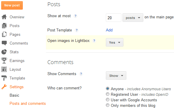
    When you click on your images or photos, a wide black iframe window opens without leaving the page and shows you the image in foreground. This Lightbox (also called as Greybox or thickbox) view effect is enabled for all Blogger blogs by default, and it can be found also on Facebook and Google +. However, for some people this effect has turned into a headache and some may prefer to turn it off.

    How to disable Lightbox view?
    • Log in to your Blogger Dashboard 
    • Go to Settings > Posts and comments  
    • Look for the "Showcase images with Lightbox" and select "No".


    Save your Settings and you're done!
    More aboutHow To Disable or Turn Off Lightbox View For Blogger Images

    Blogger Auto Video Template by webbilgi

    Posted by Unknown

    Rate this template:

    Demo: Click here for Demo

    Source And Designer: Author page

    Click here to Download


    Features:
    • Automatic thumbnail creation for Youtube videos.
    • A picture similar to the articles.
    • Custom fields gadget.
    • Simplified design.
    • Dailymotion, metacafe, vimeo, LiveLeak, YouTube, to automatically embed videos
    Usage:

    • For videos from, Dailymotion, metacafe, vimeo, LiveLeak, add the endofvid tag to the end of the link. 
    • For the video description: place the [starttext] and [endtext] code to the beginning and end of description.

    Example:
    http://www.dailymotion.com/video/xmpjro_yntikamyn-bedeli-seeking-justice-vizyonda_shortfilmsendofvid
    [starttext]
    this is description
    [endtext]

    The thumbnails for these video services are not available. You'll have to add pictures manually.

    Youtube videos: When you add the iframe code, it automatically creates a thumbnail. Instructions:When creating a post, switch to Edit HTML tab and paste the embed code of youtube video in the HTML box.
    You don't need to add any pictures.


    Other: If thumbnails don't appear, find and delete the ?rel=0 code at the end of youtube URL.
    More aboutBlogger Auto Video Template by webbilgi

    Add a Popular Posts Gallery just above your Blogger posts

    Posted by Unknown

    The most strong and popular web design trend over last couple of years is a sliding horizontal panels also known as Sliders or Carousels. It's a very effective method to increase the web site usability and engage the user. This widget shows the most popular 10 posts on your blog just above your Blogger posts. You can see the Demo on my blog.
    Let's start adding it

    Before adding it you should know that this widget is not fully compatible with all templates, so please make a backup before making any changes to your blogger template. Now, follow these steps:

    1. If you are using the old Blogger interface: 
    • Go to Dashboard - Design - Edit HTML - (make a backup) Expand Widget Template 
    If you are using the new Blogger interface: 
    • Go to Dashboard - Template - Edit HTML - Proceed - (make a backup) Expand Widget Template
    2. Search (CTRL + F) for this piece of code:

    ]]></b:skin>

    3. Just above/before it, add the following code:

    #gallery{position:relative;margin:0 35px 20px;width:590px;height:126px;background:#ffffff}
    #gallery .belt{position:absolute;top:0;left:0;list-style-type:none}
    #gallery .panel{float:left;margin:20px;width:84px;height:86px;background:url(https://blogger.googleusercontent.com/img/b/R29vZ2xl/AVvXsEhkS5u3J2oTzzIy3O7VjjKBC9Mv1kz6pZWZf-l5pK0QN4oImqPZrqKN2lI7_7HQo8NM3lxuRXrxkSaMlUqYhBBguMqTG_Kiw0rQatUIdxWdmoLQCD23ZmR8P5hDLz500XWVKvXcFQCVtQiU/s1600/bg-slider.png) bottom center no-repeat;overflow:hidden}
    #gallery .panel img{float:left;border:1px solid #DDD;margin:5px;width:72px;height:72px;background:#FFF;padding:0px}
    #gallery .panel img:hover{filter:alpha(opacity=50);-moz-opacity:0.5;-khtml-opacity:0.5;opacity:0.5}

    Note: you can adjust the size of gallery, changing the values in red (590 and 126).

    4. Now search for the following piece of code:

    </head>


    5. Just above/before it, add this code:

    <script src='http://ajax.googleapis.com/ajax/libs/jquery/1.4.2/jquery.min.js' type='text/javascript'/>
    <script src='http://fe-blogger.googlecode.com/svn/trunk/auto-slider.js' type='text/javascript'/>
    <script type='text/javascript'>
    //<![CDATA[
    stepcarousel.setup({
    galleryid: "gallery",
    beltclass: "belt",
    panelclass: "panel",
    autostep: {enable:true, moveby:1, pause:6000},
    panelbehavior: {speed:500, wraparound:true, persist:true},
    defaultbuttons: {enable: true, moveby: 2, leftnav: ["https://blogger.googleusercontent.com/img/b/R29vZ2xl/AVvXsEiju2stNMSlPducWet4cE7h1bs19g_PBcO4pqe3Cv5-wFrXMwwOLxr-Fw0SiywNJ2lQVM1uA5B85zq-OhHau6mzoM8z3Unls1l6EPXMhfqR7pMKlgGNQ7DrDpuU0r-fdjd-2HiASiX4-Iw2/s1600/prev.png", -40, 36], rightnav: ["https://blogger.googleusercontent.com/img/b/R29vZ2xl/AVvXsEgIYsdCC2mMfOIqbZO_Hy3mneCS9aE5YUbfQ_faQElzAdXFEsEkuduaGeGTorBKj9JDxw2BnNED_DaoLB1mdzMCZOCZQdrb-srudjwGvT3UGh2HDULMa8nLN9H9OOOLw87wrf2v_htTtLiO/s1600/next.png", 2, 36]},
    contenttype: ["external"]
    })
    //]]>
    </script>

    Next thing to do is to place the widget just above the blogger posts.

    6. Search for this code:

    <b:section class='main' id='main' showaddelement='yes'>

    ...or if you can'find it, search for this one:

    <b:section class='main' id='main' showaddelement='no'>

    7. Just below it, add the following code:

    <b:widget id='PopularPosts2' locked='false' title='Popular Posts' type='PopularPosts'>
    <b:includable id='main'>
    <b:if cond='data:blog.url == data:blog.homepageUrl'>
    <div style='margin-top:20px;margin-bottom:70px;margin-left:-20px;'>
      <div id='gallery'>
       <ul class='belt'>
        <b:loop values='data:posts' var='post'>
         <li class='panel'>
          <b:if cond='data:showThumbnails == &quot;false&quot;'>
           <b:if cond='data:showSnippets == &quot;false&quot;'>
            <a expr:href='data:post.href' expr:title='data:post.title' rel='bookmark'><data:post.title/></a>
           <b:else/>
            <div class='item-title'>
             <a expr:href='data:post.href' expr:title='data:post.title' rel='bookmark'><data:post.title/></a>
            </div>
            <div class='item-snippet'>
             <data:post.snippet/>
            </div>
           </b:if>
          <b:else/>
           <a expr:href='data:post.href' expr:title='data:post.title' rel='bookmark'>
            <b:if cond='data:post.thumbnail'>
             <img expr:alt='data:post.title' expr:src='data:post.thumbnail'/>
            <b:else/>
             <img alt='no image' src='https://blogger.googleusercontent.com/img/b/R29vZ2xl/AVvXsEiVxfMtiK_gU4Ej4JmRJCvXbRpmiehULMNjmUcy0KJKlyIuiKek4Zsay_fhPTY4RqLAQf_2v8kA7cSrNWm_yqgQA8EvEAH8l0SdBPIQ8SMd73l6_Ost0LzI6em5qhRgqg_JatS0amoxSrvv/s1600/no-image.PNG'/>
            </b:if>
           </a>
          </b:if>
         </li>
        </b:loop>
       </ul>
      </div></div></b:if>
     </b:includable>
    </b:widget>

    Note: delete the fragments of code in blue if you want this widget to be displayed in posts pages also.

    8. Preview and if everything is ok, Save the Template.
    More aboutAdd a Popular Posts Gallery just above your Blogger posts

    Add Google Adsense to Blogger Header (Above the Title)

    Posted by Unknown


    In the past tutorials ( See: Social Media Buttons beside Adsense ads Adsense inside Blogger Header ) i've shared several tricks for Adsense ads placement that may help you to increase your adsense earnings. Now, i will show you how to add Google Adsense above your header, for instance just above the title of your Blogger blog. This can be done by adjusting your template to give you the option of adding more than one widget to the header area.

    Add a new element to Blogger header

    1. If you are using the old Blogger interface: 

    • Go to Dashboard - Design - Edit HTML - (make a backup) Expand Widget Template 

    If you are using the new Blogger interface: 

    • Go to Dashboard - Template - Edit HTML - Proceed - (make a backup) Expand Widget Template 

    2. Next try to find (CTRL + F) this piece of code:

    <div id='header-wrapper'>

    ...if you can't find that one, search for this one:

    <div class='region-inner header-inner'>

    3. Immediately after one of these lines, you'll see this code:

    <b:section class='header' id='header' maxwidgets='1' showaddelement='no'>

    4. Replace the values in red like in this example below:

    <b:section class='header' id='header' maxwidgets='3' showaddelement='yes'>

    5. Save the Template.

    Adding the Adsense ad unit above the Blogger header

    1. Navigate to Design > Page Elements and view the new option to add a gadget to the header area


    2. Click on Add a Gadget link and select the Google Adsense gadget.

    Choose the type of ad unit you want. For this example I chose a new linked 728x15 ad unit from the dropdown format menu for an AdSense ad that would sit above the blog title. Configure colors if necessary. Color blending is usually done automatically by Blogger according to the color schema of your template.

    3. Click Save

    Now View your Blog to see your new Google Adsense unit. If all is going well, your new AdSense ad unit should appear something like in the image below:


    This is a very good Adsense placement, i'm sure you're gonna like it

    If you have a any questions, please feel free to ask below.
    More aboutAdd Google Adsense to Blogger Header (Above the Title)

    How to add an image next to Blogger Post Title

    Posted by Unknown

    blogger posts, gadgets for blogger, blogger tutorials

    It has often been said that a picture says a thousand words, so in the struggle for the attention of the reader, we can add a picture or an icon to our post title, as I have put in the title of the post in the screenshot above.

    Show Image Icon before Blogger Post Title

    Step 1:

    First thing first you have to do is to prepare an image. After that you'll need a direct link to an image before you proceed further. You can upload it to tinypic.com and copy the URL located in the Direct Link for Layouts box. Also, make sure your image is sized appropriately. You don't want to see a huge image next to your post title.

    Step 2: Go to Dashboard - Template - Edit HTML - Proceed if needed
      Step 3. Click anywhere inside the code area to find (using CTRL + F) the following code:
      <b:includable id='post' var='post'>
      Step 4. After you found it, click on the left arrow next to it to expand the widget's code


      Step 5. Then delete it until you reach to <div class='post-header'>:
                    <b:includable id='post' var='post'>
        <div class='post hentry' itemprop='blogPost' itemscope='itemscope' itemtype='http://schema.org/BlogPosting'>
          <b:if cond='data:post.firstImageUrl'>
            <meta expr:content='data:post.firstImageUrl' itemprop='image_url'/>
          </b:if>
          <meta expr:content='data:blog.blogId' itemprop='blogId'/>
          <meta expr:content='data:post.id' itemprop='postId'/>

          <a expr:name='data:post.id'/>
          <b:if cond='data:post.title'>
            <h3 class='post-title entry-title' itemprop='name'>
            <b:if cond='data:post.link'>
              <a expr:href='data:post.link'><data:post.title/></a>
            <b:else/>
              <b:if cond='data:post.url'>
                <b:if cond='data:blog.url != data:post.url'>
                  <a expr:href='data:post.url'><data:post.title/></a>
                <b:else/>
                  <data:post.title/>
                </b:if>
              <b:else/>
                <data:post.title/>
              </b:if>
            </b:if>
            </h3>
          </b:if>
      The code to be deleted:


      Step 6:

      Paste the following code in the place of the deleted code in Step 5:
      <b:includable id='post' var='post'>
        <div class='post hentry' itemprop='blogPost' itemscope='itemscope' itemtype='http://schema.org/BlogPosting'>
          <b:if cond='data:post.firstImageUrl'>
            <meta expr:content='data:post.firstImageUrl' itemprop='image_url'/>
          </b:if>
          <meta expr:content='data:blog.blogId' itemprop='blogId'/>
          <meta expr:content='data:post.id' itemprop='postId'/>

          <a expr:name='data:post.id'/>
          <b:if cond='data:post.title'>
            <table><tr>
              <td class='posttitle'>
                 <img src='IMAGE-URL'/></td>
              <td><h3 class='post-title entry-title' itemprop='name'>
            <b:if cond='data:post.link'>
              <a expr:href='data:post.link'><data:post.title/></a>
            <b:else/>
              <b:if cond='data:post.url'>
                <b:if cond='data:blog.url != data:post.url'>
                  <a expr:href='data:post.url'><data:post.title/></a>
                <b:else/>
                  <data:post.title/>
                </b:if>
              <b:else/>
                <data:post.title/>
              </b:if>
            </b:if>
            </h3>
              </td>
              </tr></table>
           
            <style>
              h3.post-title {
                margin: 0px !important;
              }
            </style>
         
          </b:if>

      Step 7:

      Replace the IMAGE-URL text in blue color from above with the URL address of your image (the one that you've gotten from Step 1).

      Step 8: Save the Template and that's it! Enjoy :)
      More aboutHow to add an image next to Blogger Post Title

      How to remove Blogger Picture/Image Shadow and Border

      Posted by Unknown

      If you want to get rid of those annoying shadows and borders around blogger images, then follow the next steps (see the difference in the screenshot below):
      If you are using the old Blogger interface:
      • Go to Dashboard - Design - Template Designer - Advanced - Add CSS - paste the following code - Press enter after the last character of the last line } - Apply to Blog.

      If you are using the new Blogger interface:
      • Go to Dashboard - Template - Customize - Advanced - Add CSS - paste the following code - Press enter after the last character of the last line } - Apply to Blog.

      .post-body img, .post-body .tr-caption-container, .Profile img, .Image img,
      .BlogList .item-thumbnail img {
        padding: none !important;
        border: none !important;
        background: none !important;
        -moz-box-shadow: 0px 0px 0px transparent !important;
        -webkit-box-shadow: 0px 0px 0px transparent !important;
        box-shadow: 0px 0px 0px transparent !important;
      }

      Now your blogger images should appear without any border or shadow. Cheers!

      Update:

      If the above method doesn't work for you, do the following:

      - Go to Blogger's Dashboard > Design (Layout) > Edit HTML
      - Thick the "Expand widget templates" checkbox;
      - Search (CTRL + F) for the following code:

        border: 1px solid $(image.border.color);

        -moz-box-shadow: 1px 1px 5px rgba(0, 0, 0, .1);
        -webkit-box-shadow: 1px 1px 5px rgba(0, 0, 0, .1);
        box-shadow: 1px 1px 5px rgba(0, 0, 0, .1);

      - Delete it and Save your template.
      More aboutHow to remove Blogger Picture/Image Shadow and Border

      Replace Older, Newer And Home Blogger links with an image or text

      Posted by Unknown

      Newer Post, Home and Older Post are links that appear on the bottom of the posts. When a visitor click on one of these links, they will take him to the page with the list of your previous posts.
      The number of the posts on these pages will be the same as the number of the posts on your main page.


      What we can do:

      A. Change the text of Newer, Older, Home links
      B. Place a picture beside them (a small icon, arrow, or whatever...)
      C. Add an image instead of the links

      So let's start customizing them...

      1. Log in to your Blogger Dashboard, go to Template > Edit HTML

      2. Click anywhere inside the code area and find - using CTRL + F keys - the following code:
          <b:if cond='data:newerPageUrl'>
            <span id='blog-pager-newer-link'>
            <a class='blog-pager-newer-link' expr:href='data:newerPageUrl' expr:id='data:widget.instanceId + &quot;_blog-pager-newer-link&quot;' expr:title='data:newerPageTitle'><data:newerPageTitle/></a>
            </span>
          </b:if>

          <b:if cond='data:olderPageUrl'>
            <span id='blog-pager-older-link'>
            <a class='blog-pager-older-link' expr:href='data:olderPageUrl' expr:id='data:widget.instanceId + &quot;_blog-pager-older-link&quot;' expr:title='data:olderPageTitle'><data:olderPageTitle/></a>
            </span>
          </b:if>

          <a class='home-link' expr:href='data:blog.homepageUrl'><data:homeMsg/></a>
      Or find in this code the following fragments which corresponds to each page links
      • <data:newerPageTitle/> represents Newer Posts link
      • <data:olderPageTitle/> represents Older Posts link
      • <data:homeMsg/> represents Home link

      Now change these fragments of codes as it follows:

      A. Change the text of Newer Posts, Older Posts and Home Links


      You need to REPLACE following parts in original code with ANY TEXT you like:
      • replace <data:newerPageTitle/> with, for example NEXT POST 
      • replace <data:olderPageTitle/> with, for example PREVIOUS POST
      • replace <data:homeMsg/> (only the first one) with, for example HOMEPAGE

        B. Place a picture beside Newer Posts, Older Posts and Home links


        Add the below code just at the beginning of each of the colored fragments of codes from step 2.
        <img src="URL Address"/>

        So it should look like this:
        <img src="URL Address"/><data:newerPageTitle/>
        Note: Replace URL Address text with the url address of the image you want to appear

        C. Replace Older Posts, Newer Posts and Home links with an image/picture


        You can place any kind of picture you want All you have to do is use this code for the pic:
        <img src="URL ADDRESS"/>
        ...just replace URL ADDRESS, with the URL of your hosted picture
        ...and in code, REPLACE the original link code for text with picture code
        • replace <data:newerPageTitle/> with the pic for newer (next) posts
        • replace <data:olderPageTitle/> with the pic for older (previous) posts
        • replace <data:homeMsg/> (only the first one) with the pic for homepage
        Screenshot
        blogger tricks, older posts, newer posts

        3. That's it! Preview and Save the Template.
        More aboutReplace Older, Newer And Home Blogger links with an image or text