How to Write SEO Optimized Blog Posts

Posted by Unknown

I'm not a SEO Expert, nor what we will read further is a top secret, but this is something about basic positioning that everyone should apply in order to optimize the blog posts. So with these techniques, effort, and lots of patience, we can occupy the best places in the search results of different search engines.

Of course, not all the cases are alike, nor all blogs are positioned similarly, some may have greater competition than others depending on how popular is the topic they handle, so when it comes to positioning there's no specific time that applies for all. Having said this, let's begin.

Focus on a topic


Whatever the theme of your blog is, when writing a post, try focusing on a definite subject that has a clear objective and has no distractions, for example, if you write about Digital Cameras, then the beginning and the end of the post should be only about it. Don't start talking about digital cameras and end up telling about what you have done last weekend. A reader goes to a page because is looking for a specific information, so unless it is not a personal blog (where you write about your daily life) do not digress.

Define the post title


The post title should be precise, so that you can briefly summarize the content of the post, but you must not abuse this either and although it should be concise, do not save words that might be keys to the search.

Examples:
Collection of all the cameras that have been released last year on the market
The best digital cameras of 2012
Clearly, the first one hasn't been defined so much and the second is not only more accurate but it is more appropriate for what people are searching on the internet.

The keywords


Keywords are those terms that the most people search for on the internet and you should try focusing on them when writing an article; these keywords have to be included throughout the entire article but you should be careful not repeating them too many times.

Example:
During the fourth week of the technology, there were many products that are consumed today, and the most famous experts gave a speech on them.
At the opening of the fourth Technology Week, the experts talked about various topics, including how to choose a digital camera, frequent discussions about the pros and cons of the iPad, and what are the best smartphones.
In the first example we have written without giving importance to any terms, however in the second one, we used phrases that are searched on the internet by the users.

So, the most frequent search terms should be included wisely but without cluttering your posts with these words, or it can be counterproductive.

These keywords should be added in the title of the posts, as well.

Rely on synonyms


While it is good using keywords, we should not limit ourselves to a single word. It is recommended using synonyms because users do not name things in same way and using less keywords, you'll avoid leaving the reader under the impression that you are being repetitive and insistent.

Examples:
Nikon D7000s Digital Camera is a 16.2 megapixel digital camera that takes great pictures, for those who like good quality pictures.
Nikon D7000s is a 16.2 megapixel digital camera that takes excellent pictures, for those who like good quality images.

In the first example we have repeated the word digital camera and pictures twice meanwhile in the second one, we used the digital camera keyword once and changed the word pictures with images.

This way, the reader will find a greater diversity of words and could enjoy the article more.

Using bold and italics


The main keywords should be highlighted, so that they will stand out from the rest; this is taken into account by the search engine robots being like some kind of lures for them, so the words with which you want to position yourself have to be highlighted with bold, but be careful, this shouldn't be done with CSS, but with HTML, i.e. they should not be tagged with font-weight: bold; but rather with <b> or even better, with <strong>.

Examples:
Nikon D7000s is a 16.2 megapixel digital camera that takes excellent pictures, for those who like good quality images.
The result seems to be the same, but it is not. Although the three sentences are in bold, only one is more attractive to robots, which is the first.
<strong>Nikon D7000s</strong> is a 16.2 megapixel <b>digital camera</b> that takes excellent pictures, for those who like <span style="font-weight: bold;">good quality images</span>.
The same goes for the italics, use them for highlighting important words, but do not put them between font-style: italic; but rather between <i> or even better <em>.
<em>Nikon D7000s</em> is a 16.2 megapixel <i>digital camera</i> that takes excellent pictures, for those who like <span style="font-style: italic;">good quality images</span>.
Again, the first has a better chance of positioning than the others. So, it is recommended to highlight the keywords in bold and italics, or put them between <strong> and </strong>, or between <em> and </em>.

Using links


Some believe that we shouldn't use links in the posts because this way we are giving away our Page Rank. This is not quite true, using referral links to sites that have already shaped their credibility, will also help us to shape our own. Certainly, we should not flood our posts with links, but do it when is necessary, and especially with sites that address the same topics as you.

Also, avoid putting the typical "click here" or similar texts. When you put a link, the anchor text should be fairly descriptive.

Examples:
<a href="Link URL">Click here</a> to know more
More information about <a href="Link URL">digital cameras</a>
In the first example, the anchor text is not relevant and descriptive, in the second it is.

Illustrating with images


Articles with images are not only visually appealing, but might help the reader to understand what you are talking about, thus, whenever you can, use an image in your post to illustrate the publishing, but do not overdo it, because many images or very large images can slow the loading time of the blog.

New and relevant content


You should focus not only on writing many posts, but also making them relevant to your readers. New and original content is more attractive to the search engines than a copy & paste, and actually the last gets penalized. So try to write new stuff, even if you think that all has been said, it isn't so, each person has a different way of saying things.

Also, always try to get informed before writing an article; do a research and see if the information is valid, based on that you will gain the trust of your readers.

With these few techniques you can increase the chances of positioning your posts on the internet. As I said earlier, these aren't things that no one heard about, but I know that many start and do not know how to optimize the blog posts.

It does not hurt repeating that the positioning is not given overnight, but with some effort and patience, you should see the desired results over time.
More aboutHow to Write SEO Optimized Blog Posts

How to Add a Tiny jQuery Circleslider to Blogger

Posted by Unknown

Tiny Circleslider is a small jQuery plugin that generates a circular carousel of images.

There is noting complicated about using this type of carousel, however when it's about customizing it, it's necessary to use a bit of arithmetic. All these details can be found in the author's homepage, so I'll just limit myself to show you the basics.


Obviously, we need to add the javascript jQuery library in our template:

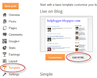
Step 1. From your Blogger's dashboard, go to Template > press the Edit HTML button


Step 2. Search for the </head> (CTRL + F) tag and just above it, add the following code:
<script src='http://ajax.googleapis.com/ajax/libs/jquery/1.10.2/jquery.min.js' type='text/javascript'/>
<script src="http://fe-blogger.googlecode.com/svn/trunk/jquery.tinycircleslider.min.js"/>
We would lack the CSS styles that we need to add above the </head> tag as well:
<style>
  #rotatescroll { /* is the rectangle container */
    height: 300px;
    position: relative;
    width: 300px;
  }
  #rotatescroll .viewport { /* is the rectangle containing the images */
    height: 300px;
    position: relative;
    margin: 0 auto;
    overflow: hidden;
    width: 300px
  }
  #rotatescroll .overview { /* is the list with the images */
    left: 0;
    list-style: none;
    margin: 0;
    padding: 0;
    position: absolute;
    top: 0;
  }
  #rotatescroll .overview li { /* each item of the list */
    float: left;
    height: 300px;
    position: relative;
    width: 300px;
  }
  #rotatescroll .overlay { /* the image with the circle overlapping the list */
    background: transparent url(https://blogger.googleusercontent.com/img/b/R29vZ2xl/AVvXsEgcq_PkD5Hw4RthyphenhyphenNswjgAmUP05Zwm8GTYHRvc70Z_t4KaPuyvFVrldyXfWCbhh4HPbyoZKFHUwRGREFLxjCwH6V4fN6IIwGzl5gZvimHVeXH4XNFjWJSgEhz-tkTmbFMWB5aeE1wgeRW4f/s1600/bg-rotatescroll.png) no-repeat 0 0;
    height: 300px;
    left: 0;
    position: absolute;
    top: 0;
    width:300px;
  }
  #rotatescroll .thumb { /* the red circle that allows us to navigate */
    background:transparent url(https://blogger.googleusercontent.com/img/b/R29vZ2xl/AVvXsEh1PSdIYf1RAOKwGi2m6CjixrZ-qO_a1IPaTg6dDUDMs57ofzU7k-3GMRzzL0Z8Xckt_JcTdjdSeiTeREUan4ohchUvq_4vrYrLnkcVXzg66kkVIsU2qBjTNhwM5_j7qKWt4Ty-0ITt3hYN/s1600/bg-thumb.png) no-repeat 0 0;
    cursor: pointer;
    height: 26px;
    left: 137px;
    position: absolute;
    top: -3px;
    width: 26px;
    z-index: 200;
  }
  #rotatescroll .dot { /* the points indicating the position of each image */
    background: transparent url(https://blogger.googleusercontent.com/img/b/R29vZ2xl/AVvXsEhCce_SYe4z80g25IVD1A3RBWxR-m3ebSAAKYmBrrGicH3LbYt-Wj2-j7dpKQmhfeXuwBo8rZT513OH0OY2L5-S5EmCrZO2qUSm-T2RHeJVugET2il46w3vY0eu3ettLgXrnI6GVdRmSkoR/s1600/bg-dot.png) no-repeat 0 0;
    display: none;
    height: 12px;
    left: 155px;
    position: absolute;
    top: 3px;
    width: 12px;
    z-index: 100;
  }
  #rotatescroll .dot span { /* are hidden by default */
    display: none;
  }
</style>
Screenshot
Step 3. Now here's the HTML that has to be added to where we want to display the carousel.
Create a New post and paste on the HTML section, the code below:
<div id="rotatescroll">
  <div class="viewport">
    <ul class="overview">
      <li><img src="imageURL" /></li>
      <li><img src="imageURL" /></li>
      <li><img src="imageURL" /></li>
      <li><img src="imageURL" /></li>
      <li><img src="imageURL" /></li>
    </ul>
  </div>
  <div class="dot"></div>
  <div class="overlay"></div>
  <div class="thumb"></div>
</div>

<script type="text/javascript">
$(document).ready(function(){ $('#rotatescroll').tinycircleslider(); });
$('#rotatescroll').tinycircleslider({ interval: true, snaptodots: true });
</script>
Screenshot

Note: replace the imageURL text with the URL of your images

and here are other options that could be added, separated by commas:

snaptodots - false if you want no dots to be shown when dragging them
hidedots - false if you want to display the internal points (by default is true)
intervaltime - is the time between slides (by default 3500)
radius - defines the size of the circle (by default is 140)
More aboutHow to Add a Tiny jQuery Circleslider to Blogger

Turn off the lights with jQuery

Posted by Unknown

For those who enjoy watching videos on the net, this is a very useful script made by Janko with jQuery.

So what this script does? It will "turn off the lights" so that everything you have on the page will be fading to dark less the video, so there will not be other elements that will distract us while watching a video and we will feel like in the cinema.

You can see an example here by clicking on the link that says "Turn off the lights".
Whenever you want, then you can click on the link again and it will turn the lights back on.

To put this effect of "lights" on the blog, go to Template > Edit HTML and before the </head> tag (CTRL + F to find it), paste the script:
<script src='http://ajax.googleapis.com/ajax/libs/jquery/1.10.2/jquery.min.js' type='text/javascript'/>
<script type='text/javascript'>
//<![CDATA[
$(document).ready(function(){
$("#darkness").css("height", $(document).height()).hide();
$(".lightSwitcher").click(function(){
$("#darkness").toggle();
if ($("#darkness").is(":hidden"))
$(this).html("Turn off the lights").removeClass("turnedOff");
else
$(this).html("Turn on the lights").addClass("turnedOff");
});
});
//]]>
</script>
Then add before ]]></b:skin> the CSS styles:
/* Turn off the lights
----------------------------------------------- */
#lightsVideo {
position:relative;
z-index:102;
}
#switch {
max-width:640px;
text-align:left;
position:relative;
height:25px;
display:block;
margin: 25px 0 0 60px;
}
.lightSwitcher {
position:absolute;
z-index:101;
background-image:url(https://blogger.googleusercontent.com/img/b/R29vZ2xl/AVvXsEijdTee3ytVsLmpmhUS1g7nyU_O8MUL0TwSuT-ZQ4a5oSd-CSk4sX6lB1dYo_88Lbd-XW014NGtLRA6MiR1Ttu53AAjm8w1lo47Rr78oqMw4apF9Ff34gnJy596R2TAG9TTaZUAydCnc22-/s1600/lights-on.png);
background-repeat:no-repeat;
background-position:left;
padding: 0 0 0 20px;
outline:none;
text-decoration:none;
}
.lightSwitcher:hover {text-decoration:underline;}
.turnedOff {
color:#ffff00 !important;
background-image:url(https://blogger.googleusercontent.com/img/b/R29vZ2xl/AVvXsEiCKMYDcfoEGRMklCTmnxp7-7xlw3ne-XvuHD6wLmskGVnZ6yUIL7C2Sg0csoR8d2fweaMm1eLKt-AQ6vn7zq8cuiR5lfWAOoZEMCRgNU-yd1ga-K-E5j5OJ4M5sD72or1YZ3HC6_15Tagn/s1600/lights-off.png);
}
#darkness {
background:#000;
opacity:0.8;
filter:alpha(opacity=80);
position:absolute;
left:0;
top:0;
width:100%;
z-index:100;
}
Click on the arrow to expand the styles
 Then, before the </body> tag, add this:
<div id='darkness'/>
And finally, wherever you put your video, either a post or a HTML/Javascript gadget, use this code:
<center>
<div id="switch"><a class="lightSwitcher" href="javascript:void(0);">Turn off the lights</a></div>
<div id="lightsVideo">
...Here goes the code of the video...
</div>
</center>
Add the code of your video to where is indicated and that's it. Now you can enjoy your videos with the lights off!

Remember that this trick uses jQuery, so if you use Scriptaculous or Mootools you should apply a patch, and if you use another version of jQuery, you must use only one.
More aboutTurn off the lights with jQuery

Before/After Photo Effect with jQuery

Posted by Unknown

If you have a design or makeup blog, or if you are using before and after image comparison, this script will surely be very useful for you.

In this tutorial we'll learn how to add the Before/After plugin, a script that works with jQuery and displays two pictures dynamically for comparing them at the same time. By dragging sideways a small bar we can see both images that are being compared.
See this Brittany Murphy pic before and after photoshop:

before
after

Implementing this script is simple, we just need jQuery, the Before/After script, and the two images that we are going to compare.

How to add the Before/After plugin to Blogger


Step 1. Go to Template > Edit HTML and before </head> (CTRL + F to find it) paste the following:
<script src='http://ajax.googleapis.com/ajax/libs/jquery/1.10.2/jquery.min.js' type='text/javascript'/>
<script src='http://http://code.jquery.com/ui/1.10.3/jquery-ui.js' type='text/javascript'/>
<script src='http://fe-blogger.googlecode.com/svn/trunk/jquery.beforeafter.min.js' type='text/javascript'/>
<script type='text/javascript'>
$(function(){
$(&#39;#beforeafter1&#39;).beforeAfter({showFullLinks : true});
});
</script>
Step 2. Click on the Save template button
Note: if the above script doesn't work for you, add it above the </body> tag. Also please verify if you have added jQuery in your template (if you did so, then remove the line in green)

Step 3. Go to Layout, add a HTML/Javascript gadget and paste this code inside the empty box:
<div id='beforeafter1'>
<div><img alt='before' src='URL of the first image' width='500' height='291'/></div>
<div><img alt='after' src='URL of the second image' width='500' height='291'/></div>
</div>
Add the URL of the first image that is the Before image, and the URL of the second image that is the After image.

It is important that you have specified the width and height of each picture so that they work on all browsers.
If you want to add more images just change the ID of the container, in this case the container is called beforeafter1 so you need to change it to beforeafter2 and so on, although you can choose any name as long as all are different.

And in the first code to paste, add another line like this one in blue:
<script src='http://ajax.googleapis.com/ajax/libs/jquery/1.10.2/jquery.min.js' type='text/javascript'/>
<script src='http://http://code.jquery.com/ui/1.10.3/jquery-ui.js' type='text/javascript'/>
<script src='http://fe-blogger.googlecode.com/svn/trunk/jquery.beforeafter.min.js' type='text/javascript'/>
<script type='text/javascript'>
$(function(){
$(&#39;#beforeafter1&#39;).beforeAfter({showFullLinks : true});
$(&#39;#beforeafter2&#39;).beforeAfter({showFullLinks : true});
});
</script>
You can add as many before/after images as you like as long as all containers have a different ID and the corresponding lines are added in the script.
Below each photo container are the "Show only Before" and "Show only after" links that when you click on them, the complete pictures will be shown. If you want to hide these links, then just change true to false in the first code and they will not be displayed anymore.

Note: if you see white space around the drag icons, then search for this code in your template:
   <Group description="Images" selector=".main-inner">
     <Variable name="image.background.color" description="Background Color" type="color" default="#ffffff" value="#ffffff"/>
... and change the #ffffff value in red to transparent.

Autor: Catch my fame
More aboutBefore/After Photo Effect with jQuery

Spacegallery: image gallery/slideshow made with jQuery

Posted by Unknown

There are many types of galleries for images that we find on the net, but we rarely see one showing images so differently like this one.
image gallery with jQuery for blogger

Those using Mac OS X will surely find a lot of similarity with TimeMachine and those who don't, I'm sure will enjoy this type of effect for viewing images.

I'm talking about Spacegallery, an image gallery done with jQuery in which images are being displayed one after another when you click on them. You can see in the example below.


To use this gallery follow the steps below:

Step 1. Log in to your Blogger Dashboard, click on your blog and then go to Template and click on the Edit HTML button.

Step 2. Search using CTRL + F keys for the </head> tag and before it paste the following:
<script src='http://ajax.googleapis.com/ajax/libs/jquery/1.10.2/jquery.min.js' type='text/javascript'/>
<script src='http://fe-blogger.googlecode.com/svn/trunk/SpaceGallery/eye.js' type='text/javascript'/>
<script src='http://fe-blogger.googlecode.com/svn/trunk/SpaceGallery/utils.js' type='text/javascript'/>
<script src='http://fe-blogger.googlecode.com/svn/trunk/SpaceGallery/spacegallery.js' type='text/javascript'/>

<script type='text/javascript'>
//<![CDATA[
(function($){
var initLayout = function() {
var hash = window.location.hash.replace('#', '');
var currentTab = $('ul.navigationTabs a')
.bind('click', showTab)
.filter('a[rel=' + hash + ']');
if (currentTab.size() == 0) {
currentTab = $('ul.navigationTabs a:first');
}
showTab.apply(currentTab.get(0));
$('#myGallery').spacegallery({loadingClass: 'loading'});
};

var showTab = function(e) {
var tabIndex = $('ul.navigationTabs a')
.removeClass('active')
.index(this);
$(this)
.addClass('active')
.blur();
$('div.tab')
.hide()
.eq(tabIndex)
.show();
};

EYE.register(initLayout, 'init');
})(jQuery)
//]]>
</script>
Screenshot
Note: if you have already added jQuery in your template, then delete the line in red.

Step 3. Search for ]]></b:skin> (CTRL + F) and when you found it, click on the arrow next to it:


Paste just above ]]></b:skin> the following CSS style:
#myGallery {
width: 100%;
height: 400px;
}
#myGallery img {
border: 2px solid #52697E;
}
a.loading {
background: url(https://blogger.googleusercontent.com/img/b/R29vZ2xl/AVvXsEj2rEUIcRdapOTUOgzksuao6Ks3OJQrSoTN3Q4Q5bxavfRvLrY2Jckt_RHopp19WIoEugwEMH5jlpdMYGjJfalMIk37MFB-IQNePtJzTVoWf7s0OgypHJwR_N92tw2r1uPybGNWxYaGHEgI/s1600/ajax_small.gif) no-repeat center;
}
.spacegallery {
position: relative;
overflow: hidden;
}
.spacegallery img {
position: absolute;
left: 50%;
}
.spacegallery a {
position: absolute;
z-index: 1000;
display: block;
top: 0;
left: 0;
width: 100%;
height: 100%;
}

Step 4. Click on the Save template button

Step 5. Finally go to Layout > Add a Gadget > HTML/Javascript and copy-paste the code below:
<div class="spacegallery" id="myGallery">
<img src="Image URL"/>
</div>
Note: In case you want to add this slideshow inside a post, then create a new post and paste the code in the HTML section

Replace the Image URL text with the URLs of the images of your gallery, keeping in mind that the last image is the first to be displayed.

And so you can enjoy this simple image gallery on your blog, and although it has no display options or settings, is without a doubt a gallery that will draw the attention of your readers.
More aboutSpacegallery: image gallery/slideshow made with jQuery

Top three qualities of a successful blogger

Posted by Unknown

Top Qualities To Become a Successful Blogger 


The qualities of a blogger should be attended at all times in order to become someone popular, a blogger should have plenty of ideas for creative writing, along with a truckload of motivation. The results sought will not come overnight, there's no guarantee. What you need first are two things in order realize your dream of running a successful blog: a lot of exclusive content and reader loyalty. In each case, time will be needed to develop the success, this is a process and not a short-term event.

qualities of a blogger

Here are three qualities of a blogger who, as a site administrator will need to provide, if his goal is to manage a successful blog.

Patience


A successful blog is a product of time and effort and as a site administrator, you will need patience. As previously mentioned the results will not arrive rapidly overnight, therefore, it is important to realize this from the start. If you are constantly trying to develop new and creative ideas for writing on your blog and at the same time you are worried if you will see any results, this will only make things more difficult. The building of a blogging platform is a "long term" effort, therefore, you must decide whether to accept the challenge or not. This is the main qualities of a blogger.

Credibility


Much of the traffic of any successful blog is based on publishing unique content and its credibility. In fact, the quality of what is in the site will have a direct impact on what will become viral visitors coming to your platform. If it's worth people will talk about your blog, and if they do, others will come to see what you have. Depends on you to publish useful and accurate information, your readers will do the rest.

Consistency


Maintaining a steady stream of creative writing ideas is vital to be able to constantly update the blog. The frequency of publication to a proper schedule is related to the measure of the amount of time you have available and your level of motivation. However, it is important to establish a sort of consistency so that people can schedule their own visits accordingly. Just remember that the more often you write, the more people will visit, so their loyalty will grow faster and their referrals will be extended.

For becoming a popular blogger is important having a healthy source of creative writing ideas, along with a lot of patience and motivation. Ultimately, it will be reduced to you as the system administrator to provide the three qualities of a blogger we discussed above, who is searching tirelessly his goal of having a successful blog. In the end, your own motivation and patience will be the glue with which all the elements will be put together for your dream to come true.
More aboutTop three qualities of a successful blogger

Add Keyboard Keys Effect To Your Text in Blogger with CSS

Posted by Unknown

For many of us the design and the template are the most important, making our readers be more interested and coming back to our blog. In this tutorial, I will show you how to create a keyboard keys effect only with CSS. It is not necessary to add an image, so that your blog will load faster.

how to add keyboard keys with css in blogger

How to Add Keyboard Keys to Blogger


Step 1: From Blogger Dashboard, go to Template > Edit HTML

edit the html of blogger template

Step 2: Look for this line (Ctrl + F)
]]></b:skin>
Screenshot
Click on the arrow to expand the code

Step 3: Just above ]]></b:skin> paste this CSS code:

kbd{
border:1px solid gray;
font-size:1.2em;
box-shadow:1px 0 1px 0 #eee, 0 2px 0 2px #ccc, 0 2px 0 3px #444;
-webkit-border-radius:3px;
-moz-border-radius:3px;
border-radius:3px;
margin:2px 3px;
padding:1px 5px;
}
Step 4: Save the change made.

Now the only thing left to do is adding the tags to the desired text to make it look as it would be inside of the keyboard keys.

For this you need to create a new post, write the text on which you want to apply the style and then switch to HTML - where you have to add before and after it, the following HTML tags:

<kbd>Ctrl</kbd> + <kbd>F</kbd>

Screenshot
text with keyboard key effect

And, it will be visible in your post as:

Ctrl + F
More aboutAdd Keyboard Keys Effect To Your Text in Blogger with CSS

How to do natural SEO on Blogger

Posted by Unknown

Although many insist that blogs hosted on free servers, such as Blogger, are not ideal for performing a correct positioning of your web site, the truth is that a blog hosted by Blogger can be really well positioned and quickly on the Internet if you are using the right SEO tools.

blogger seo

Now, given the latest updates from Google, the best would be hiring a specialized person, however, if we don't have the resources or we want to learn doing this job alone, we can choose to begin with the natural positioning. Here are some tips to start a SEO work (Search Engine Optimization).

The first thing is to pick a correct domain

We must try having our keyword included in our domain name, of course, this may sacrifice our branding but we can use the redirection.

Create Value Added Content

Not only rewrite articles, or write like it would be something for us. We should write thinking about our target audience, i.e., giving advices, tips, suggestions, guidance on specific topics and, aside, put links, use anchortext and keyfrases.

The topic of the links is important

They should be of quality and is no longer needed to place five or ten links within the text of your website, now, what matters is that the link is in context and is relevant.

Finally, the domain, in value-added content and a right use of the internal and external links, will not be useful if we don't try to update our blog constantly.

How often should you update your blog?

This is not necessary to be done on daily basis, although this may be ideal as in this way we could achieve a greater relevance in search engines, but has to be a constant work. Let's say, two or three times a week would be enough, what should not happen is updating only three times a week and doing nothing next week.

Keep in mind that search engines happen to pass daily on our blog in order to index our content.

I hope that you find these SEO tips useful and if you would like to receive more tutorials by email, subscribe for free to this blog, check out the facebook page or add the RSS feed.
More aboutHow to do natural SEO on Blogger

How to Add a Recent Forum Topics Widget to Blogger

Posted by Unknown

If you are using the Nabble forum in your blog is very likely that this gadget will interest you because, as the title says, it will show the lastest topics that have been published in your forum in a very similar manner to the recent comments gadget which uses the blog's feed.

nabble forum

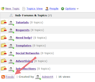
First you should go to your forum and look at the bottom where it says Feeds, click there, then two links of the Feed will appear (the first being the Topics only Feed and the other one is Topics and replies), choose the one you want.
using nabble feeds to see latest forum topics

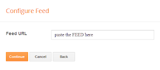
After this, log in to your Blogger Dashboard, go to Layout, click on Add a Gadget link, choose Feed from the gadgets list and paste the Feed URL you have selected inside the text box.

configure gadget feed in blogger

Click on Continue, and you only have to configure the parameters, then Save changes to see the results.

That's it! Enjoy :)
More aboutHow to Add a Recent Forum Topics Widget to Blogger

Add a forum on your Blogger blog with Nabble

Posted by Unknown

If you have many users on your blog and many comments, perhaps you should consider a forum to finish enriching your blog.
free embeddable forum with nabble

Create a Forum With Nabble


To implement a forum we will use Nabble, in my opinion, the best free option. We go to Nabble page and there, we will create an account (keep in mind that this account will be the moderator of the forum).

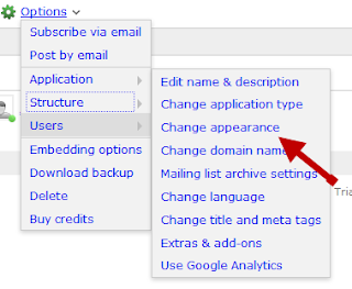
And once we have everything set (it also has a wide variety of customizing options), go to Options -> Application -> Change appearance:

nabble change appearance

There, we can also edit the CSS of the forum and other things...

Now we have to give the structure of a real forum, i.e. organizing it by categories. To do this click on the Options menu, select Application, then click Change application type:

nabble option change application type

Then choose the Forum category and save your changes.

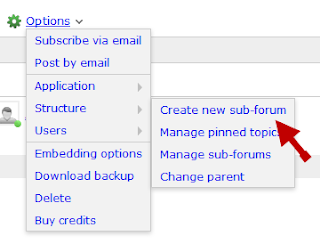
To finish, we only have to create categories and for this go back to Options, this time select Structure and then choose Create a new sub-forum:
nabble create new sub-forum

Fill in the details of the category and that's it, you will have your forum running.

The rest are small details, like sort categories (Options > Structure > Manage sub-forums), customize your avatar and your signature (YourNickname > Account Settings), change permissions (Options > Users > Permissions), etc..

Now for integrating the newly created forum to your blog, you must go to Options - Embedding options and copy the javascript code.
nabble forum embedding options

Embed the forum in a Blogger page


Go to your Blogger Dashboard and create a new Blank Page


Once there, get in the HTML mode.

Paste here the code that we copied earlier, and if everything went well, we should see our brand new forum for our blog!
create a forum for blogger with nabble

I hope this tutorial was helpful to you and you will begin using this great service.
More aboutAdd a forum on your Blogger blog with Nabble