
Tiny Circleslider is a small jQuery plugin that generates a circular carousel of images.

There is noting complicated about using this type of carousel, however when it's about customizing it, it's necessary to use a bit of arithmetic. All these details can be found in the author's homepage, so I'll just limit myself to show you the basics.
Obviously, we need to add the javascript jQuery library in our template:
Step 1. From your Blogger's dashboard, go to Template > press the Edit HTML button

Step 2. Search for the </head> (CTRL + F) tag and just above it, add the following code:
Step 3. Now here's the HTML that has to be added to where we want to display the carousel.
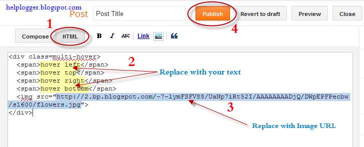
Create a New post and paste on the HTML section, the code below:
Note: replace the imageURL text with the URL of your images
and here are other options that could be added, separated by commas:
snaptodots - false if you want no dots to be shown when dragging them
hidedots - false if you want to display the internal points (by default is true)
intervaltime - is the time between slides (by default 3500)
radius - defines the size of the circle (by default is 140)
More about → How to Add a Tiny jQuery Circleslider to Blogger

There is noting complicated about using this type of carousel, however when it's about customizing it, it's necessary to use a bit of arithmetic. All these details can be found in the author's homepage, so I'll just limit myself to show you the basics.


Obviously, we need to add the javascript jQuery library in our template:
Step 1. From your Blogger's dashboard, go to Template > press the Edit HTML button

Step 2. Search for the </head> (CTRL + F) tag and just above it, add the following code:
<script src='http://ajax.googleapis.com/ajax/libs/jquery/1.10.2/jquery.min.js' type='text/javascript'/>We would lack the CSS styles that we need to add above the </head> tag as well:
<script src="http://fe-blogger.googlecode.com/svn/trunk/jquery.tinycircleslider.min.js"/>
<style>
#rotatescroll { /* is the rectangle container */
height: 300px;
position: relative;
width: 300px;
}
#rotatescroll .viewport { /* is the rectangle containing the images */
height: 300px;
position: relative;
margin: 0 auto;
overflow: hidden;
width: 300px
}
#rotatescroll .overview { /* is the list with the images */
left: 0;
list-style: none;
margin: 0;
padding: 0;
position: absolute;
top: 0;
}
#rotatescroll .overview li { /* each item of the list */
float: left;
height: 300px;
position: relative;
width: 300px;
}
#rotatescroll .overlay { /* the image with the circle overlapping the list */
background: transparent url(https://blogger.googleusercontent.com/img/b/R29vZ2xl/AVvXsEgcq_PkD5Hw4RthyphenhyphenNswjgAmUP05Zwm8GTYHRvc70Z_t4KaPuyvFVrldyXfWCbhh4HPbyoZKFHUwRGREFLxjCwH6V4fN6IIwGzl5gZvimHVeXH4XNFjWJSgEhz-tkTmbFMWB5aeE1wgeRW4f/s1600/bg-rotatescroll.png) no-repeat 0 0;
height: 300px;
left: 0;
position: absolute;
top: 0;
width:300px;
}
#rotatescroll .thumb { /* the red circle that allows us to navigate */
background:transparent url(https://blogger.googleusercontent.com/img/b/R29vZ2xl/AVvXsEh1PSdIYf1RAOKwGi2m6CjixrZ-qO_a1IPaTg6dDUDMs57ofzU7k-3GMRzzL0Z8Xckt_JcTdjdSeiTeREUan4ohchUvq_4vrYrLnkcVXzg66kkVIsU2qBjTNhwM5_j7qKWt4Ty-0ITt3hYN/s1600/bg-thumb.png) no-repeat 0 0;
cursor: pointer;
height: 26px;
left: 137px;
position: absolute;
top: -3px;
width: 26px;
z-index: 200;
}
#rotatescroll .dot { /* the points indicating the position of each image */
background: transparent url(https://blogger.googleusercontent.com/img/b/R29vZ2xl/AVvXsEhCce_SYe4z80g25IVD1A3RBWxR-m3ebSAAKYmBrrGicH3LbYt-Wj2-j7dpKQmhfeXuwBo8rZT513OH0OY2L5-S5EmCrZO2qUSm-T2RHeJVugET2il46w3vY0eu3ettLgXrnI6GVdRmSkoR/s1600/bg-dot.png) no-repeat 0 0;
display: none;
height: 12px;
left: 155px;
position: absolute;
top: 3px;
width: 12px;
z-index: 100;
}
#rotatescroll .dot span { /* are hidden by default */
display: none;
}
</style>
 |
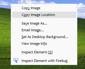
| Screenshot |
Create a New post and paste on the HTML section, the code below:
<div id="rotatescroll">
<div class="viewport">
<ul class="overview">
<li><img src="imageURL" /></li>
<li><img src="imageURL" /></li>
<li><img src="imageURL" /></li>
<li><img src="imageURL" /></li>
<li><img src="imageURL" /></li>
</ul>
</div>
<div class="dot"></div>
<div class="overlay"></div>
<div class="thumb"></div>
</div>
<script type="text/javascript">
$(document).ready(function(){ $('#rotatescroll').tinycircleslider(); });
$('#rotatescroll').tinycircleslider({ interval: true, snaptodots: true });
</script>
 |
| Screenshot |
Note: replace the imageURL text with the URL of your images
and here are other options that could be added, separated by commas:
snaptodots - false if you want no dots to be shown when dragging them
hidedots - false if you want to display the internal points (by default is true)
intervaltime - is the time between slides (by default 3500)
radius - defines the size of the circle (by default is 140)


.jpg)

