
jGlideMenu is a vertical menu that can be dragged and dropped so that the reader can place it anywhere, and in addition, he can browse through the tabs in a very peculiar manner that comes with a sliding effect giving a sexy touch.
One of the advantages is that it can store a large number of links and can be removed anytime if we want.

To understand this menu better and to see it in action, visit this demo blog. There we can drag the menu, navigate through its tabs or close.
To add this vertical menu on your blog, just follow these steps:
1) From your Blogger dashboard, go to Template > Edit HTML and before the </head> tag, add these scripts:
If you want to add more links to the first level, then add another line like this:
Yes, it sounds complicated, but once you understand the concept, you'll see that is actually pretty simple.
In the area of the styles, there are the parts that can be customized. If you want the menu to be static, let's say you want to add it in the sidebar, then delete the first code of the script that is in italics. And in the CSS styles, remove this part:
Throughout the menu structure we can change the Menu name and the descriptions as well.
As this menu is made with JQuery, it is recommended to verify to have only one version of it.
More about → Vertical drop down menu with jQuery
One of the advantages is that it can store a large number of links and can be removed anytime if we want.
To understand this menu better and to see it in action, visit this demo blog. There we can drag the menu, navigate through its tabs or close.
To add this vertical menu on your blog, just follow these steps:
1) From your Blogger dashboard, go to Template > Edit HTML and before the </head> tag, add these scripts:
<script src='http://ajax.googleapis.com/ajax/libs/jquery/1.7.1/jquery.min.js' type='text/javascript'/>2) Now paste before ]]></b:skin> these styles:
<script src='http://ajax.googleapis.com/ajax/libs/jqueryui/1.7.1/jquery-ui.min.js' type='text/javascript'/>
<script src='http://fe-blogger.googlecode.com/svn/trunk/jQuery.jGlideMenu.min.js' type='text/javascript'/>
<script type='text/javascript'>
//<![CDATA[
$(document).ready(function(){
$('#jGlide_001').jGlideMenu({
tileSource : '.jGlide_001_tiles' ,
demoMode : false
}).show();
$('#switch').click(function(){$(this).jGlideMenuToggle();});
});
//]]>
</script>
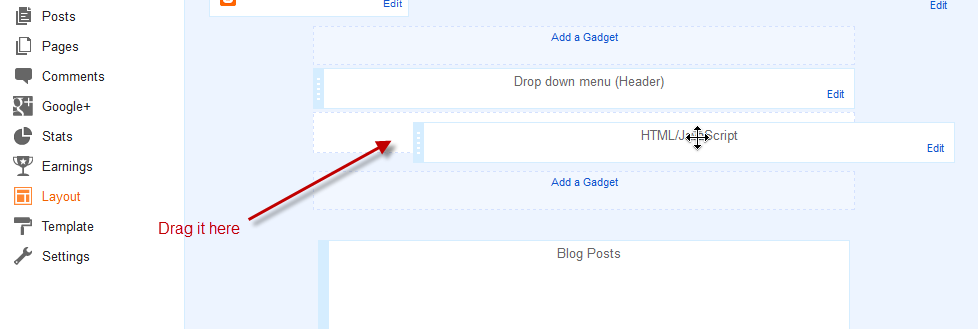
.jGM_box {3) Now go to Layout and paste the structure of the menu inside a HTML/Javascript gadget:
position: absolute; /* Change absolute with fixed if you want it to float */
top: 50px; /* Distance from above */
right: 760px; /* Distance from right */
width: 227px;
height: 317px;
background: #fff; /* Background color */
margin: 0;
padding: 0;
border: 1px solid #ccc; /* Border */
overflow: hidden;
}
.jGM_header {
position: absolute;
top: 0;
left: 0;
height: 18px;
width: 227px;
background: #d1d1d1; /* Background color for the up bar */
color: #fff;
text-align: right;
vertical-align: middle;
line-height: 18px;
cursor: move;
}
.jGM_header a {
margin-right: 12px;
text-decoration: none;
color: #000 !important;
cursor: pointer;
}
.jGM_wrapper {
position: absolute;
top: 19px;
left: 0;
width: 2270px;
height: 288px;
margin: 0;
padding: 0;
border: 0;
}
.jGM_tile {
position: absolute;
top: 0;
left: 7px;
width: 213px;
height: auto;
overflow: hidden;
margin: 0;
padding: 0;
border: 0;
display: block;
}
.jGM_cats {
width: 100%;
height: 64px;
overflow: hidden;
vertical-align: middle;
text-align: left;
}
.jGM_cats h4 {
font-family: Verdana,Arial,serif;
font-size: 1.8em;
margin: 0;
padding: 2px 0;
line-height: 1.8em;
color: #414141;
font-weight: normal;
}
.jGM_cats p {
font-family: Verdana,tahoma,arial;
font-size: 1em; /* Font size of the description */
margin: 0;
padding: 0;
line-height: 1.2em;
color: #858585; /* Description color */
font-weight: normal;
}
.jGM_pager {
height: 18px;
width: 213px;
line-height: 18px;
margin: 0;
border: 0;
padding: 0;
background: #f6f6f6;
text-align: center;
vertical-align: middle;
}
.jGM_pager a {
text-decoration: none;
font-weight: bold;
text-decoration: none;
display: block;
}
.jGM_pager a:hover { background: #d1d1d1; }
.jGM_pager img { border: 0; margin: 6px 0; }
.jGM_content {
width: 213px;
height: 150px;
margin: 1px 0;
padding: 0;
border: 0;
overflow: hidden;
}
.jGM_content a {
font-family: Tahoma,arial;
text-decoration: none;
color: #333 !important;
height: 18px;
width: 100%;
display: block;
line-height: 18px;
padding: 0 0 0 10px;
background-color: #e6e7e9;
margin: 1px 0;
}
.jGM_content a:hover {
color: #fff !important;
background-color: #4D4E67; /* Bar color on mouseover */
}
.jGM_more {
background-image: url(https://blogger.googleusercontent.com/img/b/R29vZ2xl/AVvXsEg_lebENDZnVXG3xgZH1It8TU5tHxtaAEoLQgVgrKtddwbS53BE_uDRgnQSHAcfJthiQf13VkDlqcxrCSXMToWnLrknJJn0jHkPPXcFDX_rYDekqsdbng6DcewVt4c0J3vt8d77saGH1ZE/s1600/arrow.gif);
background-repeat: no-repeat;
background-position: 203px 50%;
}
.jGM_back {
position: absolute;
top: 255px;
right: 0;
height: 18px;
width: 52px;
background: #d1d1d1;
line-height: 18px;
vertical-align: middle;
text-align: center;
margin: 10px 0 0 0;
padding: 0;
border: 0;
z-index: 99;
}
.jGM_back a {
height: 100%;
width: 100%;
text-decoration: none;
color: #000 !important; /* Color of the "Back" link */
display: block;
}
.jGM_back a:hover {
color: #fff !important; /* Color of the "Back" link on mouseover */
background: #4D4E67;
}
.jGM_reset {
position: absolute;
top: 255px;
right: 62px;
height: 18px;
width: 52px;
background: #d1d1d1;
line-height: 18px;
vertical-align: middle;
text-align: center;
margin: 10px 0 0 0;
padding: 0;
border: 0;
z-index: 99;
}
.jGM_reset a {
height: 100%;
width: 100%;
text-decoration: none;
color: #000 !important; /* Color of the "Home" link */
display: block;
}
.jGM_reset a:hover {
color: #fff !important; /* Color of the "Home" link on mouseover */
background: #4D4E67;
}
<div class="jGM_box" id="jGlide_001">Add the URLs of the links and the names of the tabs and that's it.
<!-- Here all the links of the first level -->
<ul id="tile_001" class="jGlide_001_tiles" title="Menu" alt="Description of the first level">
<li rel="tile_002">Link 1</li>
<li rel="tile_003">Link 2</li>
<li rel="tile_004">Link 3</li>
<li rel="tile_006">Link 4</li>
<li rel="tile_007">Link 5</li>
<li><a href="URL address">Link 6</a></li>
<li><a href="URL address">Link 7</a></li>
<li><a href="URL address">Link 8</a></li>
<li><a href="URL address">Link 9</a></li>
<li><a href="URL address">Link 10</a></li>
<li><a href="URL address">Link 11</a></li>
</ul>
<!-- Here all the links of the second level -->
<ul id="tile_002" class="jGlide_001_tiles" title="Menu" alt="Description of the second level">
<li rel="tile_005">Link 1.1</li>
<li><a href="URL address">Link 1.2</a></li>
<li><a href="URL address">Link 1.3</a></li>
<li><a href="URL address">Link 1.4</a></li>
</ul>
<ul id="tile_003" class="jGlide_001_tiles" title="Menu" alt="Description of the second level">
<li><a href="URL address">Link 2.1</a></li>
<li rel="tile_008">Link 2.2</li>
<li><a href="URL address">Link 2.3</a></li>
</ul>
<ul id="tile_004" class="jGlide_001_tiles" title="Menu" alt="Description of the second level">
<li><a href="URL address">Link 3.1</a></li>
<li><a href="URL address">Link 3.2</a></li>
<li><a href="URL address">Link 3.3</a></li>
</ul>
<ul id="tile_006" class="jGlide_001_tiles" title="Menu" alt="Description of the second level">
<li><a href="URL address">Link 4.1</a></li>
<li><a href="URL address">Link 4.2</a></li>
<li><a href="URL address">Link 4.3</a></li>
</ul>
<ul id="tile_007" class="jGlide_001_tiles" title="Menu" alt="Description of the second level">
<li><a href="URL address">Link 5.1</a></li>
<li><a href="URL address">Link 5.2</a></li>
</ul>
<!-- Here all the links of the third level -->
<ul id="tile_005" class="jGlide_001_tiles" title="Menu" alt="Description of the third level">
<li><a href="URL address">Link 1.1.1</a></li>
<li><a href="URL address">Link 1.1.2</a></li>
</ul>
<ul id="tile_008" class="jGlide_001_tiles" title="Menu" alt="Description of the third level">
<li><a href="URL address">Link 1.2.1</a></li>
<li><a href="URL address">Link 1.2.2</a></li>
</ul>
</div>
If you want to add more links to the first level, then add another line like this:
<li><a href="URL address">Link 12</a></li>If you want to add another level to the link, then the line should be like this:
<li rel="tile_0010">Link 5</li>Then in the area of the second or third level, add a piece like this:
<ul id="tile_0010" class="jGlide_001_tiles" title="Menu" alt="Description of the second level">Here you should keep something in mind, if you look closely the link takes the REL attribute which must be the same as the ID we put on the second level, these IDs should not repeat and always be unique.
<li><a href="URL address">Link 5.1</a></li>
<li><a href="Url address">Link 5.2</a></li>
</ul>
Yes, it sounds complicated, but once you understand the concept, you'll see that is actually pretty simple.
In the area of the styles, there are the parts that can be customized. If you want the menu to be static, let's say you want to add it in the sidebar, then delete the first code of the script that is in italics. And in the CSS styles, remove this part:
position: absolute; /* Change absolute with fixed if you want it to float */When there are many links then, there will be showing some arrows, so when you mouseover them, it will show the rest of the links either up or down.
top: 50px; /* Distance above */
right: 760px; /* Distance to the right */
Throughout the menu structure we can change the Menu name and the descriptions as well.
As this menu is made with JQuery, it is recommended to verify to have only one version of it.


.jpg)

